Hi there!
This is the second in a series of blog posts, where I am documenting the progress of my project and my experience working with aerospaceresearch.net for Google Summer of Code 2019.
Last time I went into details about the often synonymous concepts, in the engineering world, of designing and optimizing a system. The provided context served as a prerequisite for explaining the purpose and the motivation behind both the KSat project, as well as my contribution in the project, which is the development of an automated visualization system to explore different design points, gain insights about the optimization process and the genetic algorithm’s performance, aid in debugging and more. In case you missed it and you would like to have more information, you can find the first blog post here: https://aerospaceresearch.net/?p=1542 . In fact, I highly recommend that you have read the first blog post before moving on with the second one.
From this point on, this blog post will focus on the progress during the second coding period. Before I get into technical topics, since I am documenting the whole experience, I would like to write a couple of words about the collaboration and the communication within aerospaceresearch.net. Like mentioned in the first blog post, everyone inside the organization has been extremely welcoming and helpful even from the pre-application stage. As it is to be expected during the second coding period, I was even more familiar with my project as well as with the exact fit of my work in the bigger picture. The communication with my main mentor, Manfred, continues to take place in an almost daily base for anything related to my work and I would like to thank him one more time for his valuable input and our great collaboration.
Regarding the technical aspects of my project, attention was first given in making the visualizations more presentable and readable. For this purpose, the structure of the xml that serves as an input to the visualization system, was extended to accommodate the following functionality:
-) Application of custom axes limits or limits that are calculated from the optimization data.
-) Definition of viewing angle for the 3d plot.
-) Definition of plot title.
-) Definition of axes labels that correspond to degrees-of-freedom (DoFs) that are assigned in x-, y- and z- axis.
-) Definition of legends that correspond to DoFs that are assigned in line style and line color as well as marker and marker color.
Some additional options like defining the font size for the title, the labels and the legends are available. The above functionality is more or less self-explanatory, but in order to make things more tangible the following visualizations from the first blog post are presented. The difference here is, that the visualizations have been properly annotated by activating the corresponding options through the xml file.
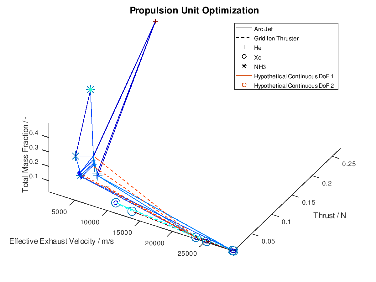
The first visualization from the first blog post, would take the following form:
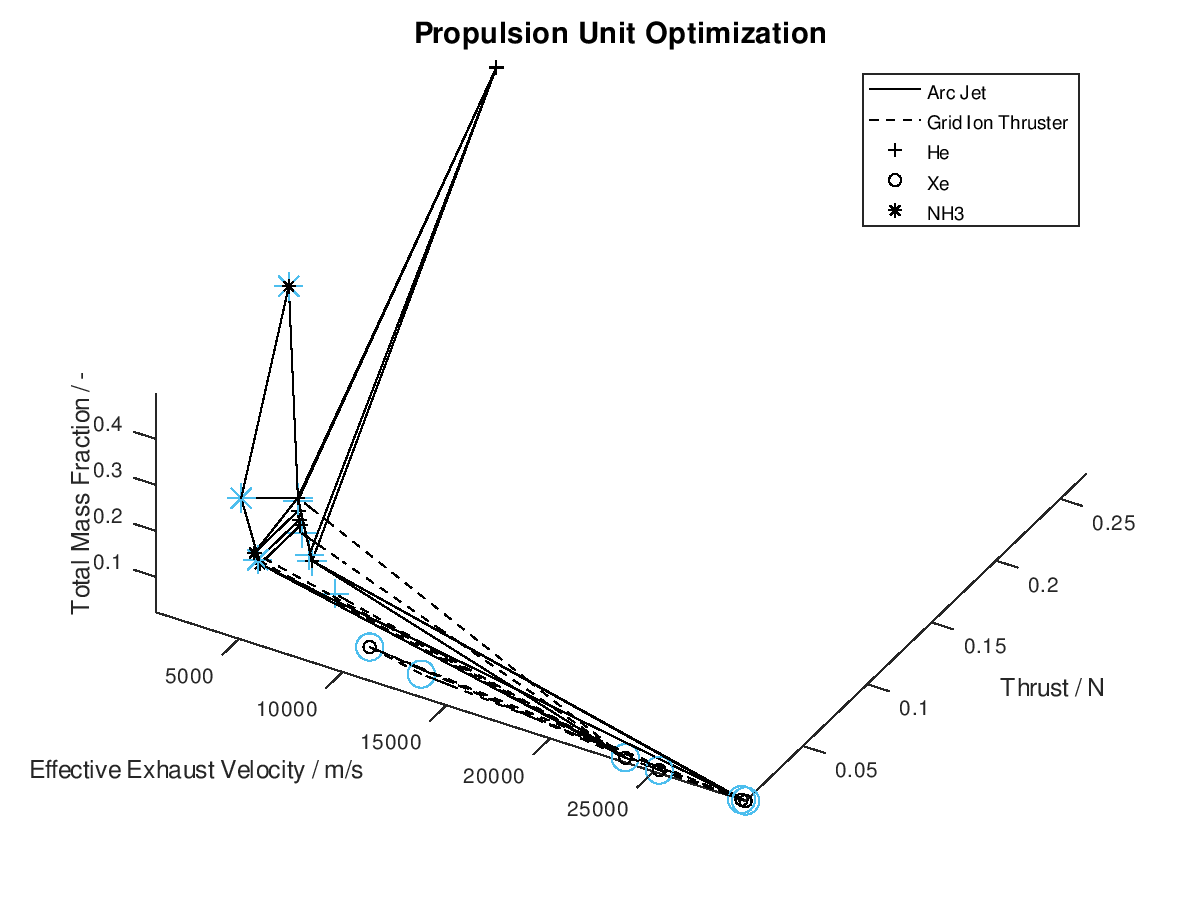
In the figure above, I have defined “Propulsion Unit Optimization” as the title to applied on the plot as well as “Effective Exhaust Velocity / m/s”, “Thrust / N”, and “Total Mass Fraction / -“ as the labels of the x-, y- and z- axis correspondingly. In addition, I have specified that the axes limits should be calculated from the optimization data and that the viewing angle should be [azimuth, elevation] = [30, 60]. I have also enabled the legend for the remaining of the activated DoFs, which in this case are propulsion type and propellant. As it can be seen on the legend, propulsion type (arc jet or grid ion thruster) has been assigned to line style (solid or dashed), while propellant (He, Xe or NH3) has been assigned to marker (crosshair, circle or star). The chosen font sizes in this example are 14 for the title, 12 for the labels and 9 for the legends. At this point it should be noted that some of the above options, concerning the appearance of the visualization, were also manually applied at the corresponding visualization of the first blog post. The difference here is, that their automatic application has now been implemented as a series of activatable options in the xml file.
Now that we have an idea about the way in which the majority of a visualization’s elements are annotated, lets also see how potential additional continuous DoFs that are assigned to line and marker color are presented. For this purpose, we are going to use the last visualization from the first blog post, which would take the following form:
The difference in this visualization compared to the previous one is, that two additional hypothetical continuous DoFs have been assigned to line and marker colour. To indicate this, the corresponding DoFs “Hypothetical Continuous DoF 1” and “Hypothetical Continuous DoF 2” are included in the legend with a colored line and mark. Notice that are all other elements in the legend are black. The colored elements indicate that the value of these continuous dofs corresponds to the line and marker color in the visualization.
Now that we have covered the annotation of the visualizations, lets move to the remaining implemented functionality. A second type of visualization, a 2d visualization, was added in the visualization system. The motivation for the 2d plot is similar to the motivation for the 3d plot. Different system DoFs can be assigned to y-axis, line style and color as well as marker style and color. Notice that the x- and z-axis are no longer available to the user. At this point you may ask what the purpose of the 2d plot is then. In the 2d plot the x-axis corresponds to the generations of the system’s evolution, thus the 2d plot can be used to acquire a clearer picture regarding the chronological order in which different lineages evolve through different design points.
As usual I am going to give a practical example. I assign total mass fraction to y-axis, propulsion type to line style, propellant to marker, effective exhaust velocity to line color and thrust to marker color. I deactivate the visualization of failed mutations, I sort the lineages by total mass fraction and I keep only the 5 best lineages. I also activate the use of the implemented annotations. The plotting system returns the following figure:
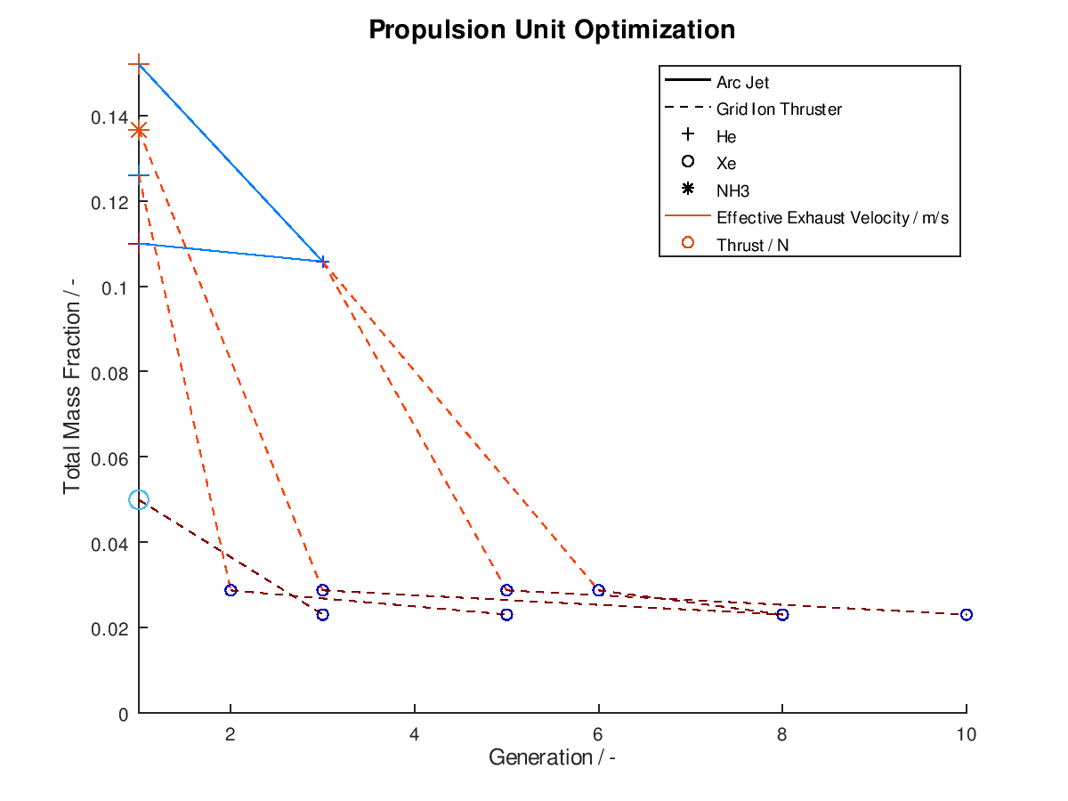
As we can see from the figure above, all lineages converge to almost identical final design points. One lineage achieves this in just 3 generations, while another one need as much as 10 generations. In between of improved design points, we can also observe the number of generations where failed mutations occurred. For the lineage that converges on the 10th generation we can see that the successful mutations take place at the 3rd, 6th and 10th generation. This means that the mutations of the generations 2, 4-5 and 7-9 were failed mutations.
Another implemented feature is the ability to save the generated visualizations in a desired file format. This is required in order to review the progress of the optimization process after the execution of an optimization cycle. For this purpose, the following functionality was implemented as an activatable option through the xml file.
-) Saving of the visualization in one or more file formats. The available file formats are: *.ps, *.eps, *.jpg, *.png, *.emf, *.pdf
-) Generating filenames according to input case number, input/mission parameters and plot case number.
In order to avoid loss of any generated visualization it is important that the generated filenames always remain different regardless of the number of visualizations or the activated filename options. For this purpose, a hard-coded fail-safe check was also included. A sample generated filename could be “input_case_1_totalimpulse_112670_deltav_686_plot_case_1”. In this case, the input case number, the mission parameters (total impulse and velocity increment) along with their corresponding values and the plot case number, were all included in the title. For distinction purposes between different visualizations the plot case number is always included in the title, while in the absence of mission parameters the input case number is also automatically included.
Finally, another way to reap more potential insights from the visualizations is to include the dimension of time in them. This was achieved to a certain extend with the use of the 2d plot where the x-axis corresponds to the generations. There is another way to do so, where the graphics objects that form the visualizations are animated through a series of frames that follow the evolution of the system that is being optimized. The output is a series of frames that form a gif animation, rather than a single snapshot. The graphics objects can be animated in two different ways.
According to the first approach, the graphics objects are animated separately for each lineage. The sequence of the design points that correspond to the best lineage are animated first, then those that correspond to the second best and so on. This animated version of the last visualization of the first post, is the following:

In the animation above, only the 10 best lineages have been included. The frame rate of the animation is defined at 2 fps through the xml file.
The other way in which the graphics objects of a visualization can be animated, is for all lineages together. In this case, the sequence of the design points of all selected lineages is animated according to the progression of the generations. Design points that appear on the same frame correspond to mutations of different lineages that took place on the same generation during the optimization process. This animated version is the following:
It should be noted that the examples for which the animations were applied, are simplified, thus a certain visual overlap occurs between different lineages. This causes the animations to appear stagnant at times, while what is really happening is that some lineages follow an identical sequence of design points as others. These design points have already appeared in the visualization due to already visualized lineages or due to lineages that have advanced through them at an earlier generation, giving the illusion that the animation remains stagnant at times, but this is not the case.
One final thing to mention is, that not only a 3d plot but also a 2d plot can be animated in a similar fashion.
Summing up this second blog post, we got a brief overview as well as a quick demonstration of the newly added features. We saw how these features build on top of the existing ones and open the possibilities for further exploration of the evolution data. There are some cases where minor bug fixes are required, and potential improvements and extensions have already been identified. Documentation is also going to be developed, but all that is work for the following weeks …
Congrats for making it through the second blog post and many thanks for reading!