Hello everyone!
With these series of blogs posts I will be documenting the progress of my project and my experience working with aerospaceresearch.net for Google Summer of Code 2019.
First, a few words about my mentors from aerospaceresearch.net and the communication between us. The main mentor of my project is Manfred Ehresmann, with whom we discuss almost daily for everything regarding my project. Since there is also a lot of development going on from Manfred’s side, effective communication for defining my project’s requirements, coming to common ground regarding technical matters that affect the work of both and solving any issues that arise has been key to the progress of my project and I am very happy that we have effortlessly achieved this. My second mentor is Andreas Hornig and since he is the main mentor of other projects, we communicate on a less regular basis for everything regarding my work with aerospaceresearch.net and my participation in GSoC. Andreas has also been incredibly helpful throughout this time, from guiding us through the application process to taking care of our onboarding in the organization and making sure that we have everything set up to be able to work undistracted on our projects. The platform that we use for our communications is Zulip.
Now it’s time for an introduction to the GSoC project and my contribution. Manfred is developing a software for designing space craft systems, currently limited to electric propulsion units for satellites. Since in the engineering world, the word “design” is most of the times synonyms to the word “optimize”, the later is actually the goal of the software. That is, to use data from existing systems and additional resources along with system modelling and scaling rules, in order to apply a genetic algorithm that can design an optimized space craft subsystem, which is an electric propulsion system currently, for different mission scenarios. This optimization is not straight forward, especially when there are a lot of sub-systems with non-linear interactions between them to be included in future development. Additionally, the algorithm itself has a lot of hyperparameters, whose tuning is a non-trivial task. For this reason, it is useful to have a way to evaluate the progress of the optimization process, in order to gain insights that can either lead in improvements of the algorithm or be directly utilized my human designers as well as aid in debugging of newly added features. This is where my contribution to the code comes. I am developing a visualization system which can be used to automatically generate useful visualizations from the evolution data of the genetic algorithm according to user defined parameters.
Let’s say a few words about the work that has been completed during the 1st coding period. During the previous weeks I have been laying out the architecture of the visualization system, defining the structure of the xml file that is used by the user to communicate with the system and implementing the first type of plot, the 3d plot. By this time, you may wonder what this plot is, in which way it is using the evolution data and how is it even useful in the first place! To get a better understanding, let’s talk about optimization for a second.
What does it mean to optimize an electric propulsion system? Well, first let’s define what it means to design a system. To design a system means to select the appropriate values for some variables of the system. These are here the effective exhaust velocity, thrust, propulsion type, propellant and more. For initial system design these are enough to fully define the rest of the systems parameters by using known system modelling equations and scaling laws equations as well as any system or mission requirements, for example total impulse, velocity increment, propulsion power. We can name the first set of variables, independent degrees-of-freedom (dofs) of the system, and the second set of variables that are calculated from the first, dependent dofs. The goal of the design process is to come up with a system that achieves a certain performance. If we define a specific performance criterion (ex. mass fraction of the electric propulsion unit), then by systematically searching for the best (optimal) values of the independent dofs we can come up with a system that best meets this performance criterion (ex. has the lowest mass fraction). This process is called optimization. In our case, a genetic algorithm is used for searching the optimal values of the independent dofs, which can be either continuous variables (ex. effective exhaust velocity, thrust) or discrete variables (ex. propulsion type, propellant). The electric propulsion system has also additional dependent variables/parameters (ex. mass fractions and efficiencies of sub-systems) which are calculated from the independent variables.
By visualizing the evolution data, we want to observe how the system moves along the design space during the optimization process. We want to see whether the mutations of the system are successful or not and we want to identify the design points where the system converges and possibly observe any other piece of information or pattern that can help improve the optimization and better understand the optimal designs. For this purpose, we want to plot different system variables (ex. effective exhaust velocity, thrust, propulsion type, propellant etc.) against the objective criterion (ex. system mass fraction). Using a 3d plot we can assign the objective criterion to the z-axis, the effective exhaust velocity to the x-axis and the thrust to the y-axis. In order to include additional dofs into the visualization, we can encode them into other aspects of the visualization, specifically line style, line color, marker and marker color. Continuous or discrete dofs can be assigned to line color and marker color by mapping the values of the dofs to the colors of a corresponding color map. Additionally, discrete dofs can be assigned to line style and marker by mapping the values of the dofs to a corresponding set of line styles and markers.
Using the xml file, we can define which system dofs (ex. system mass fraction, effective exhaust velocity etc.) are assigned to each plot dof (x-axis, y-axis, line style, line color etc.). The key capabilities of the visualization system can be summed up in the following points:
-) Flexible assignment of system dofs to plot dofs.
-) Selection of color maps, line styles, markers etc. to be used in the visualization.
-) Definition of default visualization style.
-) Activating or deactivating the visualization of failed mutations.
-) Defining custom visualization style for failed mutations.
-) Defining custom visualization size for seed points.
-) Defining multiple plot cases.
-) Specifying active input cases.
-) Sorting lineages by a specified dof.
-) Selective plotting of lineages.
In order to get a better understanding of the capabilities of the visualization system, let’s go over a few potential use cases. Let’s say that an optimization campaign has been completed and we would like to start exploring the evolution data that has been created by the genetic algorithm.
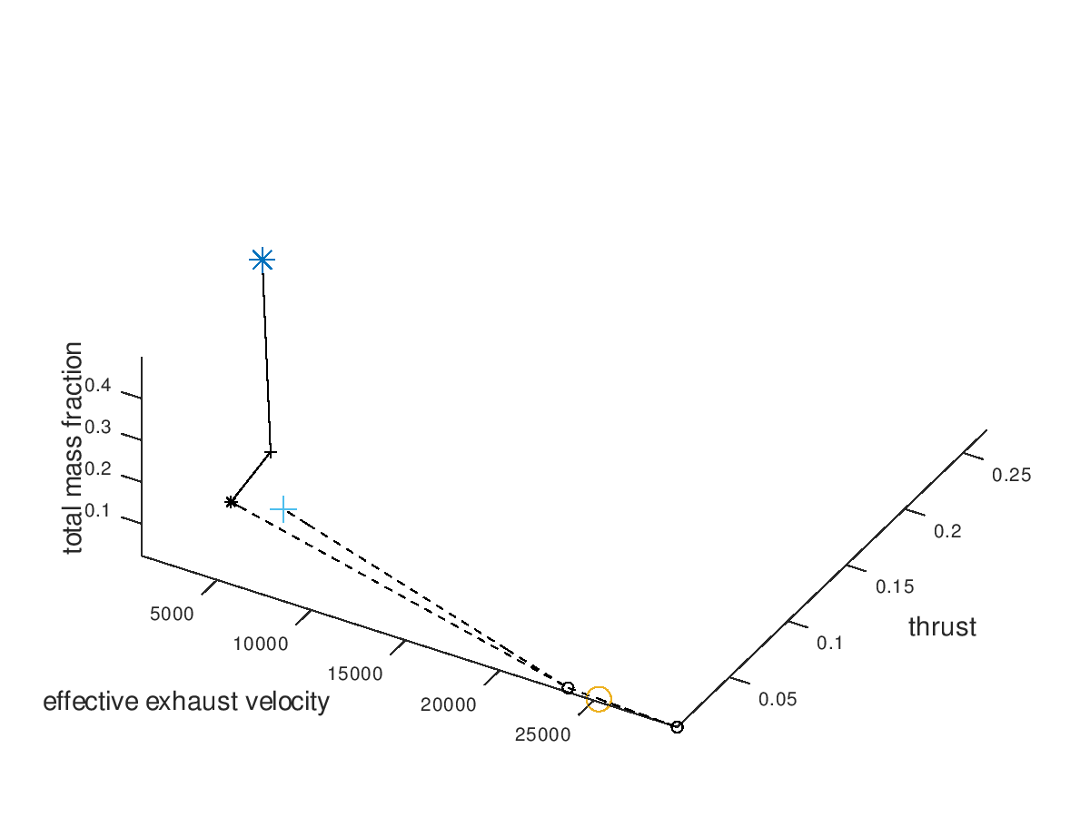
First, I assign the system dofs, for which I am interested, to corresponding plot dofs. In these examples I am going to assign effective exhaust velocity to x-axis, thrust to y-axis, total mass fraction to z-axis, propulsion type to line style and propellant to marker. I will also define that the possible propulsion systems (arcjet, grid ion thruster) are going to map to line styles (solid, dashed) and the possible propellants (He, Xe, NH3) are going to map to markers (crosshair, circle, star). I am also going to activate the visualization of failed mutations, but I am going to leave deactivated the custom visualization style for failed mutations, since with this first visualization I just want to observe how the design space has been explored by the algorithm. The visualization system returns the following figure:
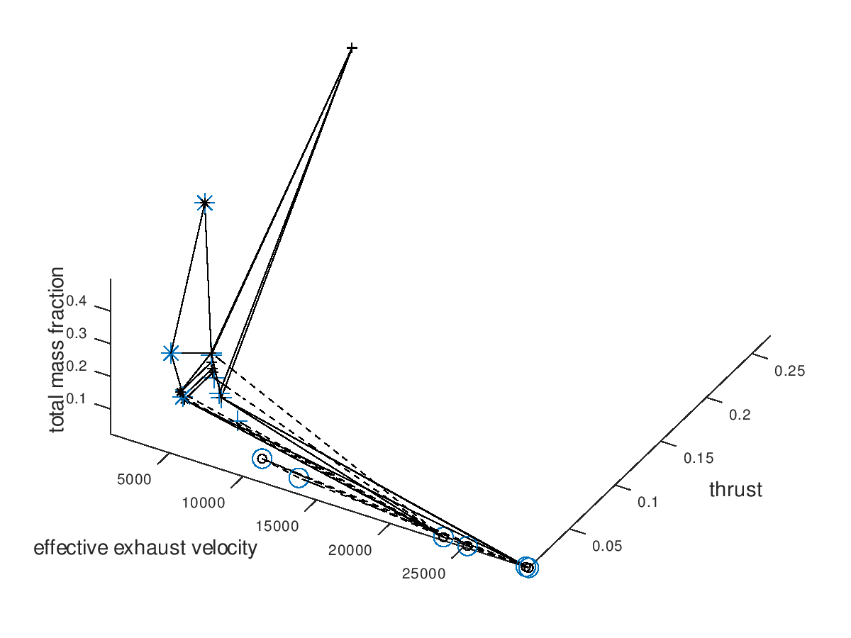
In the figure above, we can see that only a certain portion of the design space has been explored. The seed points are represented by the large blue markers. Since line color and marker color has not been assigned to a system dof, they are black, which is the default visualization style that I have specified.
Now we are going to use the capabilities of the visualization system to gradually get a deeper understanding of our data. It would be interesting to see which portion of the mutations are successful. For this purpose, I am going to activate custom visualization style for the failed mutations, and I will specify red color for line color and marker color. The visualization system returns the following figure:
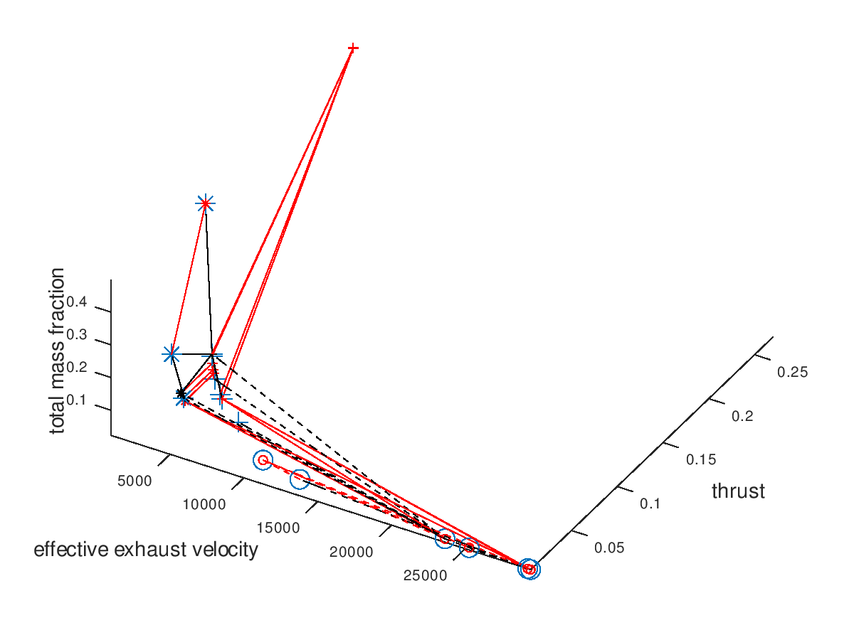
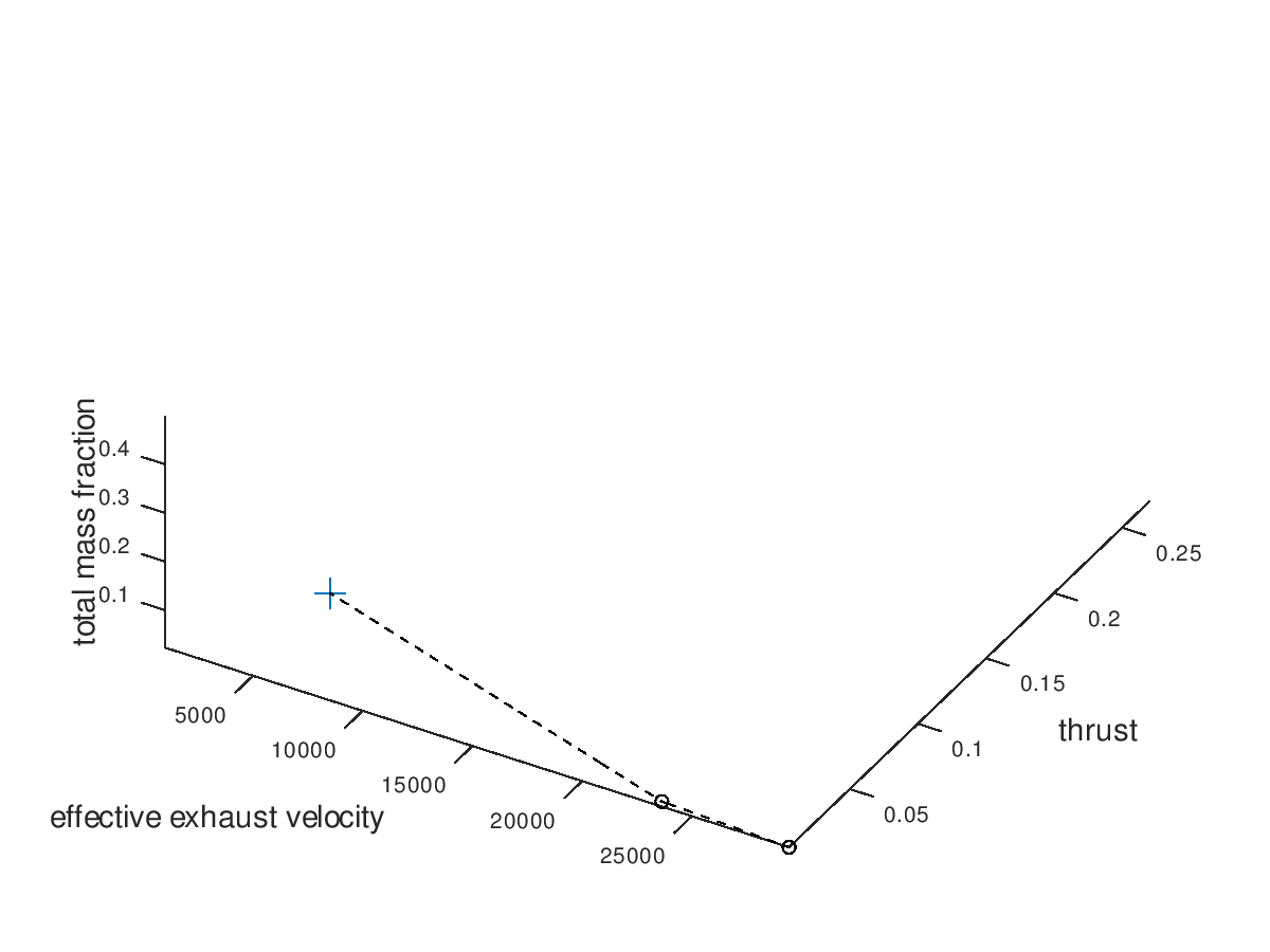
From the figure above it is clear that the majority of the mutation are failed mutation. For this reason, I would like to visualize only the successful mutation. To do this, I deactivate the visualization of failed mutations. The visualization system returns the following figure:
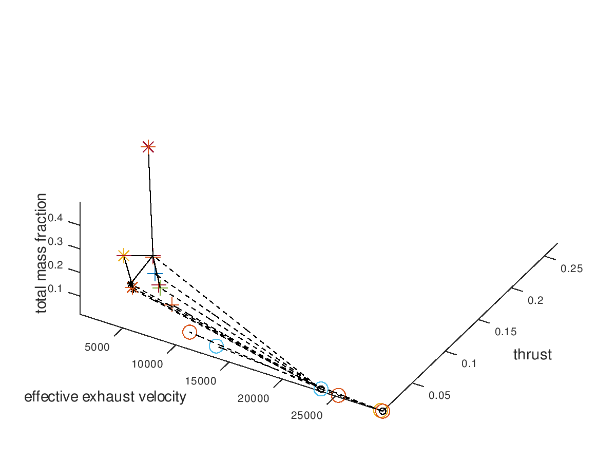
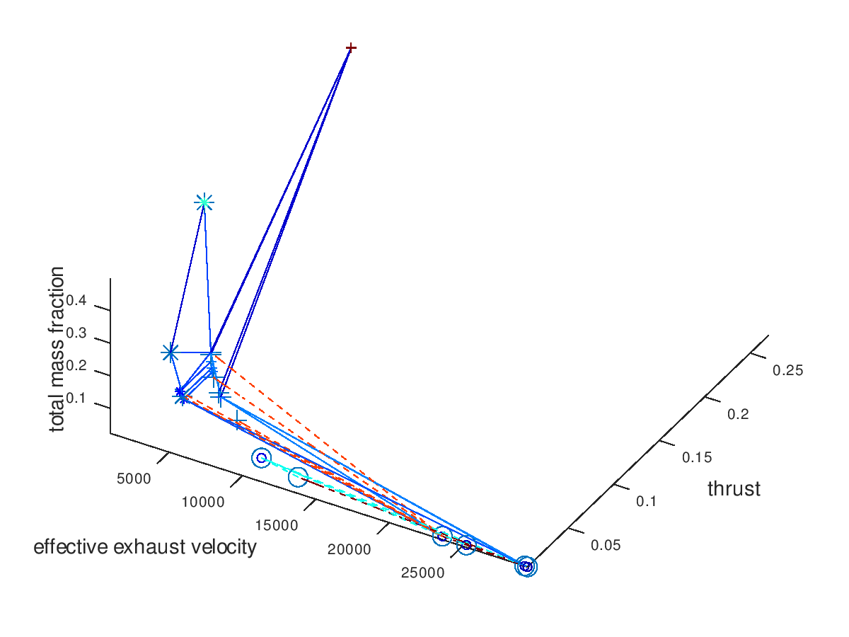
The trend of the optimal design points to converge to high effective exhaust velocity, low thrust, grid ion thruster propulsion (dashed line) and Xe propellant (circle marker) is easily recognizable. Note that the seeds points have now different colors, which is currently a bug rather than an implemented feature. Next, I want to visualize only the three best designs. For this purpose, I am going to define the total mass fraction as the sorting criterion of lineages and select “increasing” as the sorting direction, since the best designs are the ones with the lowest total mass fractions. The visualization system returns the following figure:
We can see that all 3 lineages converge to the same design point. It would be interesting to also explore the behavior of the 3 worst lineages. The visualization system returns the following figure:
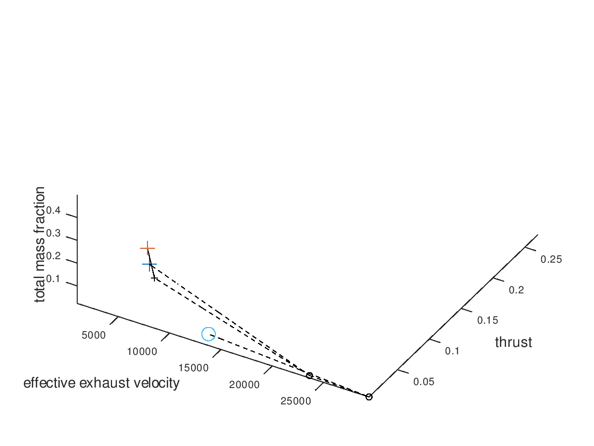
By surprise, the three worst lineages also converge to the same optimal design point. This means that our algorithm is very robust to the selection of initial seed points, at least for this simpler example. To confirm that all lineages converge to the same design point, I am also going to visualize only the worst lineage. The visualization system returns the following figure:
Indeed, all lineages converge to the same design point because the worst one does so. At this point we could come up with more visualizations to explore, but for the purpose of briefly demonstrating the flexibility of the visualization system these examples are considered enough.
One last thing to demonstrate is what the visualization would look like when line color and marker color are also assigned to a system dof. That would be the case if the model of the electric propulsion system had additional independent dofs. For this example, we are going to assume that two hypothetical continuous dofs are assigned to line color and marker color respectively. I am going to define “jet” as the color map for both line color and marker color. I am also going to activate the visualization of failed mutations and include all lineages in the visualization. The visualization system returns the following figure:
As we can see from the figure above, the two additional dofs have been encoded in the visualization.
Summing up this first blog post, there are still a few things that need to be implemented in the visualization system regarding the presentation of the 3d plot (labels, legends, viewing angle, limits etc.) which will be added soon. An additional type of plot as well as animation capabilities are going to be added during the following coding periods. But for now, …
Many thanks for reading and cheers to the space and GSoC community!