This third blog post will present the progress of my project during the final coding period.
If this is your first time reading about the ESDC project it is highly recommended that you go through the first https://aerospaceresearch.net/?p=1542 and second https://aerospaceresearch.net/?p=1571 posts before continuing with this one.
During the previous coding periods the key functionality that was planned for this project was implemented. Thus, during the final coding period there was time for improvements, development of one additional feature whose inspiration came up during the previous period, refactoring and organizing the file structure of the code as well as documenting the implemented tool for feature users or developers.
First, the following improvements were made:
-) The way in which the minimum and maximum value of a continuous degree-of-freedom is calculated was adjusted. Previously the minimum and maximum value was calculated from the aggregate of the evolution data, which includes all lineages and generations of the genetic optimization process. Now these values are calculated specifically for each visualization scenario, only from the relevant lineages and generations according to user defined options.
-) The part of the code responsible for generating the animations was refactored and extended to include the option to save the animations as compressed gif files. The need for this arose after finding that the size of the gif files would easily grow to tenths of megabytes even for the simple optimization scenarios examined here.
Next, an additional type of graphic, which allows for the visualization of useful subsystems’ information on top of the existing 2d or 3d visuals was implemented. This is a stacked bar graph spanning the y-axis on the 2d plots and the z-axis on the 3d plots. The units of the stacked bar graphs are the same as the units of the corresponding axis that it’s spanning. The height of the individual bars of a stack are proportional to the values of the corresponding degree-of-freedom of the respective subsystems that each bar is representing.
Currently, the stacked bar graphs are used to visualize the distribution of the electric propulsion system’s total mass fraction into the corresponding subsystems. Thus, the stacked bar graphs can be used to explore how the mass fraction of each individual subsystem is changing as the genetic algorithms navigates through different design points. To better understand this, let’s explore two examples.
The first example is a 2d visualization, where the y-axis has been assigned to total mass fraction, the line style to propulsion system type, the line color to effective exhaust velocity, the marker to propellant and the marker color to thrust. Additionally, the stacked bar charts have been activated. As the y-axis corresponds to the total mass fraction, each bar of the stacks will correspond to the mass fraction of the respective subsystem. Only the best lineage is selected for visualization. The visualization system returns the following figure:
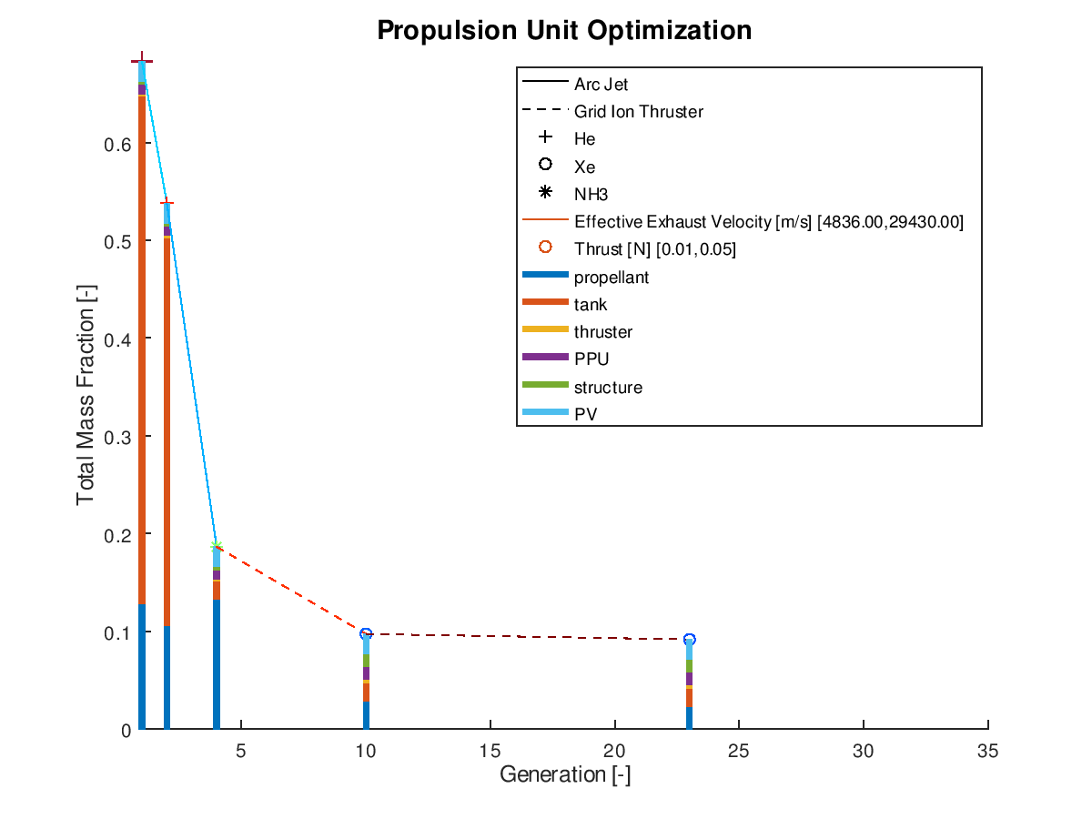
In the figure above, we can examine how the mass fraction of each subsystem evolves as the design of the system becomes optimal. In this simplified example, we can see that the majority of the decrease of the total mass fraction can be attributed to the reduction of the propellant and tank subsystems. Of course, for this shrinkage to happen and the electric propulsion system to be able to achieve the mission requirements, additional adjustments in other aspects of the systems are being made by the optimization algorithm. Specifically, between the starting and the final design point we can see that the propulsion system type changes from Arcjet (solid line) to Grid Ion Thruster (dashed line), the propellant changes from He (crosshair marker) to Xe (circle marker), the effective exhaust velocity is increased (line color turns deep red from light blue and “jet” is the chosen colormap) and the thrust is decreased (marker color turns deep blue from deep red and “jet” is the chosen colormap).
The stacked bar graphs can also be activated in 3d visualizations. In this next example, the x-axis has been assigned to effective exhaust velocity, the y-axis to thrust, the z-axis to total mass fraction, the line style to propulsion system type and the marker type to propellant. Only the best lineage is selected for visualization. The visualization system returns the following figure:
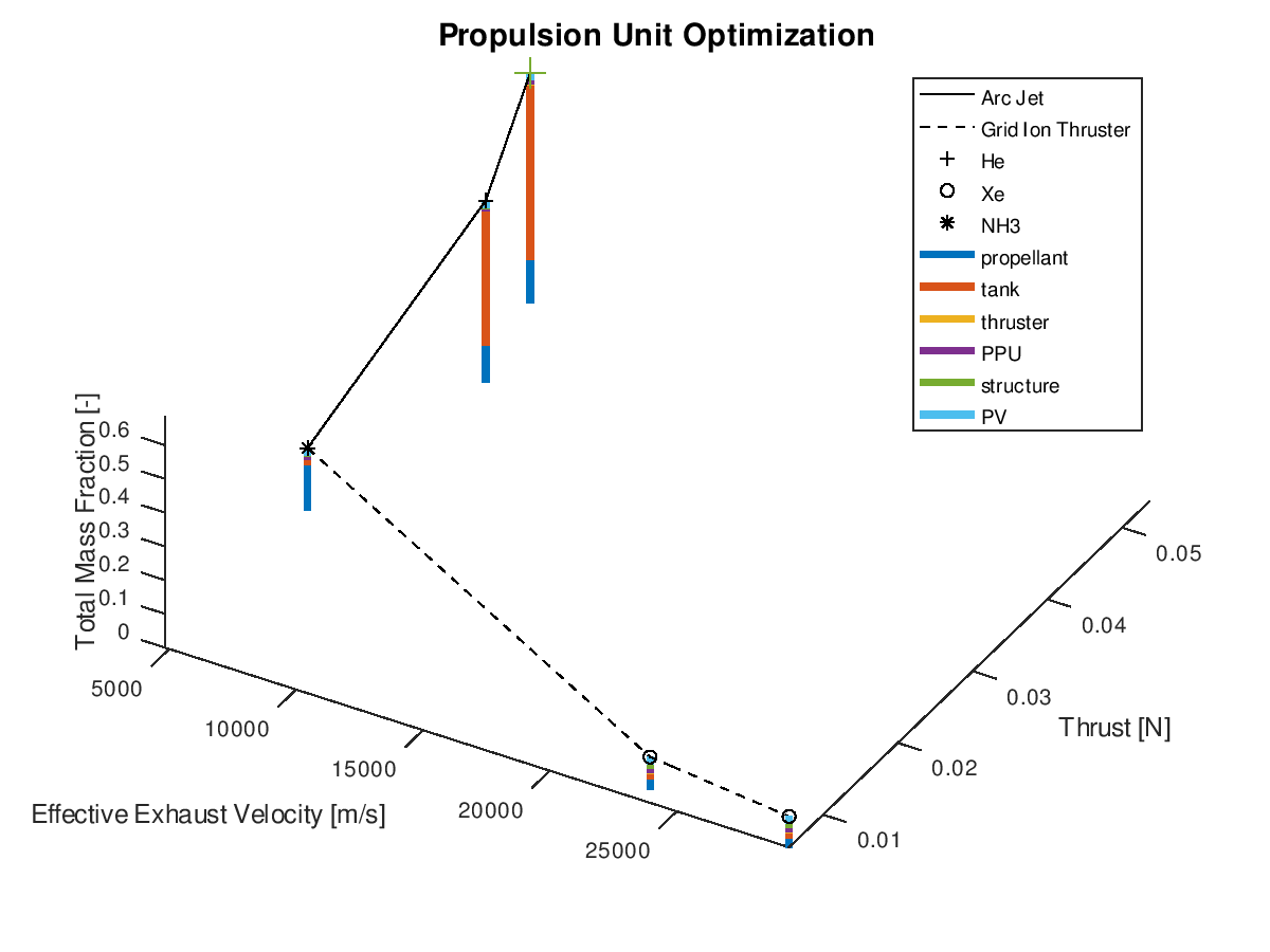
Like the previous example, it’s easy to point out that the reduction of the total mass fraction can be greatly attributed to the reduction of the propellant and tank subsystems.
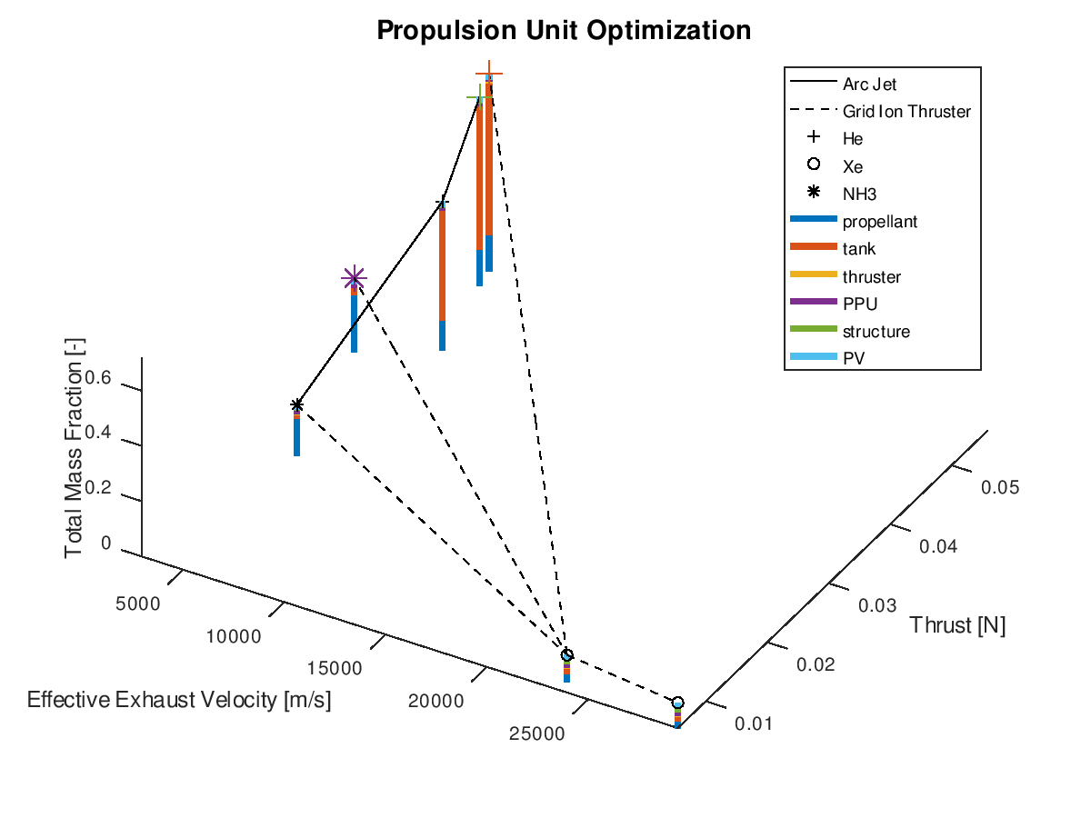
When using the stacked bar graphs in the 3d plot, it is also practical to include more lineages in the visualization. Selecting the three best lineages, the visualization system returns the following figure:
After this final feature was implemented, additional refactoring of the code was done to simplify certain parts and achieve improved extendibility and readability. Refactoring the code was also done to end up in a restructured organization of functions into subfolders. As the visualization system was designed with flexibility, modularity and extendibility in mind, it is consisted of more than 100 functions. For this reason, a function dependency graph proved a great aid for understanding the existing dependencies and making the appropriate refactoring and restructuring decisions.
Finally, additional documentation was created for this project to accompany the blog posts during GSoC. All details regarding the available options and settings for configuring the visualization system according to specific needs can be found in the documentation. There, one can also find ready to use XML input file templates which correspond to the visualizations found in all GSoC blog posts.
Congratulations if you ‘ve made so far, this was the last long post! A final report will also be released very soon!