In my last blog the process of accurately extracting sync locations within the NOAA APT signal was explored. In this blog, I would like to extend the comparison of the two methods that were implemented. Then look at how the process is influenced by presence of noise, sample drops and doppler effect.
Last time, briefly we compared how the two methods of identifying the sync: (1) with scipy’s correlate and (2) with normal correlation. We found that both of the methods were similar in the results produced, however the norm correlation was computationally expensive. Eventhough this is the case, we decided to use norm correlation as the default as opposed to scipy’s correlate, because: (1) The range of output is fixed, unlike the output of scipy’s correlate, where the range will depend on input signals. (2) Scipy’s correlate may not work for all signals, this appears to be a special case of a signal where it worked because of the -ve part of the ’needle‘ signal and zero part of the main signal. Hence we recommend the users to choose the appropriate correlation function as per their need.
Testing of the sync finder
An appropriately large signal was captured and was used to test the sync finding mechanism. When we first calculated the distance between consecutive syncs, we found alarming fluctuations. Further investigations attributed this fluctuation to either presence of noise or sample drop by the SDR.
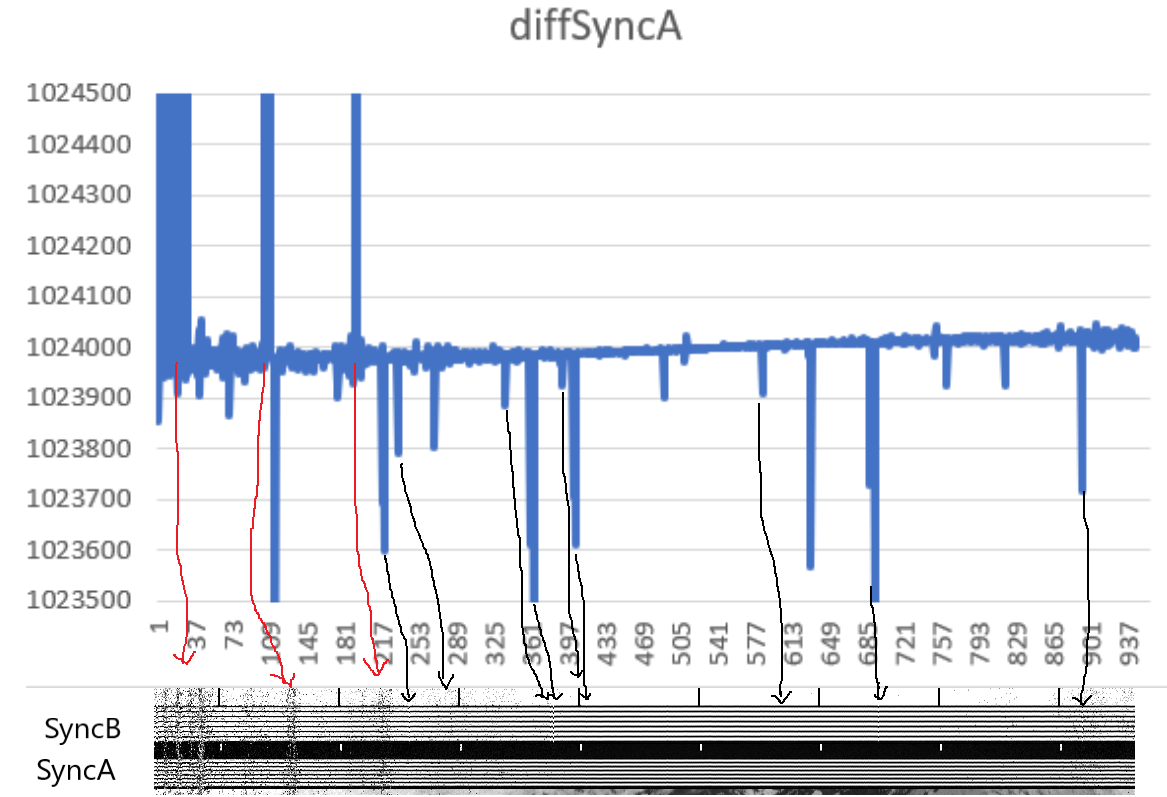
In the above graph: distance between consecutive syncs vs. sync #, we observe high fluctuations. When we compare this with the syncA and B parts of the decoded image we can conclude the following:
(a) When there is noise, we see the fluctuation because some sync detections would have missed, in essence skipping intermediate syncs. Hence increasing the distance between consecutive syncs. Therefore a positive overshoot.
(b) When there was sample loss, naturally the distance between those syncs will decrease, hence a negative shoot.
How do we know it was sample loss?
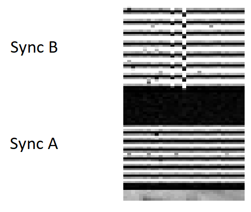
In the above decoded image (Only syncA and B are shown, rest is cropped), we can see that syncA’s are perfectly aligned (because our software will always align an image starting with syncA) where as, at some points syncB is mis aligned. This clearly is the proof of data loss. Some data was lost, hence the location of sync has come nearer to syncA.
How doppler shift affects the sync finding?
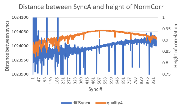
Because of doppler effect, the frequency of the signal will change by a bit, but for correlation we are using a needle of fixed frequency. Hence, the doppler effect will have an influence in the sync detection. We can observe in the above graph: Distance between syncs and height of the peak found vs. sync # is plotted. We can clearly observe that the correlation peaks when the distance is about 1024000 i.e. ~0.5 seconds, which is the ideal case. However on the either side of the peak, due to doppler effect the frequency mismatch leads to decrease of the correlation peak. Nevertheless, the software is still able to detect the peaks appropriately and performs well.
What to expect in next blog
In the next blog, we will discuss about decoding the image, then further corrections that need to applied to the image to enhance it. We will also discuss about some visual improvements such as adding false colors and overlaying a map.