It’s been almost two months I started to work on VisMa as my GSoC-19 Project (although I have been working with the community since December 2018) and it has been a quiet learning experience. This post will focus on technical details of what VisMa team has improved in the project roughly during the span of Phase II of GSoC.
Week 5: During this time, my goal was to complete the work regarding the Discrete Mathematics module. As I have mentioned in the previous Blog, we had added some basic Combinatorics modules (Factorial, Permutation & Combinations), this week our plan was to take this expedition forward and add some more to this Module. Also, we intended to implement the combinatorics module in CLI/GUI, which has not been done yet. Firstly I added the comments and animations in the above-mentioned modules. Adding comments and animations always seems like a cakewalk, but as per me doing this is actually hard and time-consuming (reason being, you have to keep a track of all the equations which occur during any operation). However, once done it always gives a sweet sense of completion, as it did this case. Our next target during Week 5, was to add more to the Discrete Mathematics module. We decided on adding a Statistics Module, a Probability Module and a (bitwise) boolean algebra module. The Statistics module as of now contains basic functions to calculate mean, median and mode like measures. Statistics is a topic of prime importance, thus having a statistics module is useful for the project. The other reason behind adding this module is that VisMa already has a graph plotter, this in later versions when combined with Statistics module can be used for the analysis of user-entered data. The other major part of Discrete Mathematics module was (bitwise) boolean algebra modules. These modules are designed keeping the teaching purpose of the project in mind. The comments and animations in these modules are in such a way that student will be able to observe how each bit of a number is being operated with the subsequent bit of the other number to get the final result. This part has been solely implemented keeping teaching perspective in mind. Lastly, we added a simple Probability Module to the project. As of now, we have Combinatorics, Probability, Statistics and (bitwise) boolean Algebra module added in the project.
Week 6: This week our task was to improve the integration and differentiation module of the project. The earlier logic and code for these two modules was beautifully implemented. My task was to add integration and derivation function to all Function Classes of the Project. Function Classes, in very simple terms, is a name given to a super-class of tokens whose subclasses are Constant, Variable etc. I had to add differentiation and integration for all these subclasses. Many of these were implemented but some were missing. Among missing ones, were Trigonometric, Exponential and Logarithmic Classes. I wrote the respective functions for all these Function Classes, also adding comments and animations side by side. Also, I refactored the existing code in differentiation & integration modules to follow an object-oriented style. Also added some test cases for same.
Week 7: The task of this week was focussed on improving the tokenizing module, adding some corner cases in Expression Simplification (involving exponents) and fixing some potential bugs. The tokenizer module treated Variable raised to some power, as a single token of Variable type (with the value of pow parameter set to power), but it didn’t recognise power operator in any case, my task was to fix it for recognising power operator. The potential bugs with Expression Simplification could only be resolved after it was done. The Expression Simplification follows a recursive logic, thus adding even a small improvement in that module sometimes become much confusing. But finally it was done in a nice manner, and VisMa is now able to deal with almost all the cases involving Expressions and Exponents. I also added test cases to reflect the new behaviour of the project.
Current Goal: As of now, I am working on implementing Matrix Module in CLI/GUI, the matrix operations have been implemented and now the next goal is to enable users to enter Matrices interactively in CLI/GUI
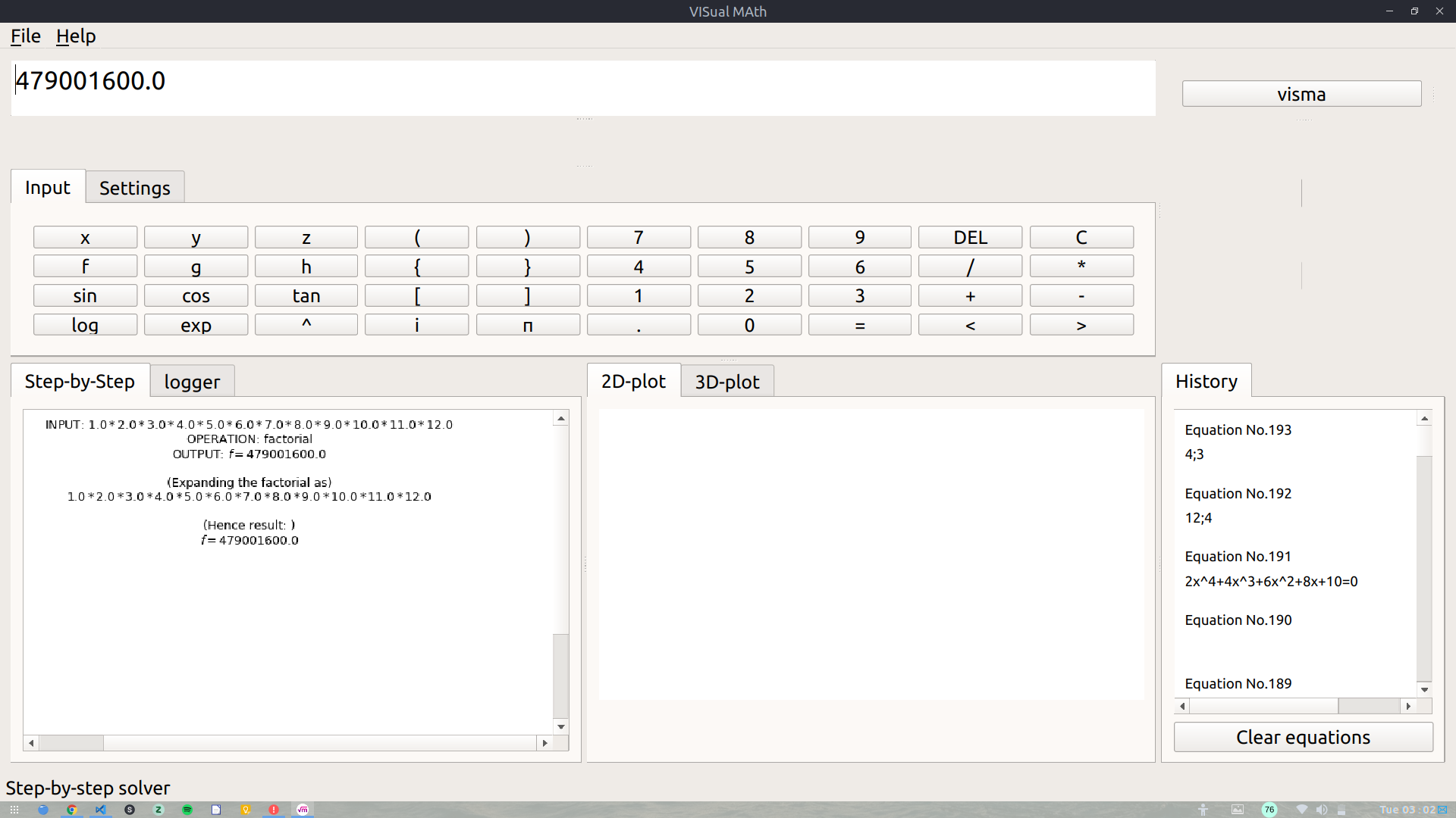
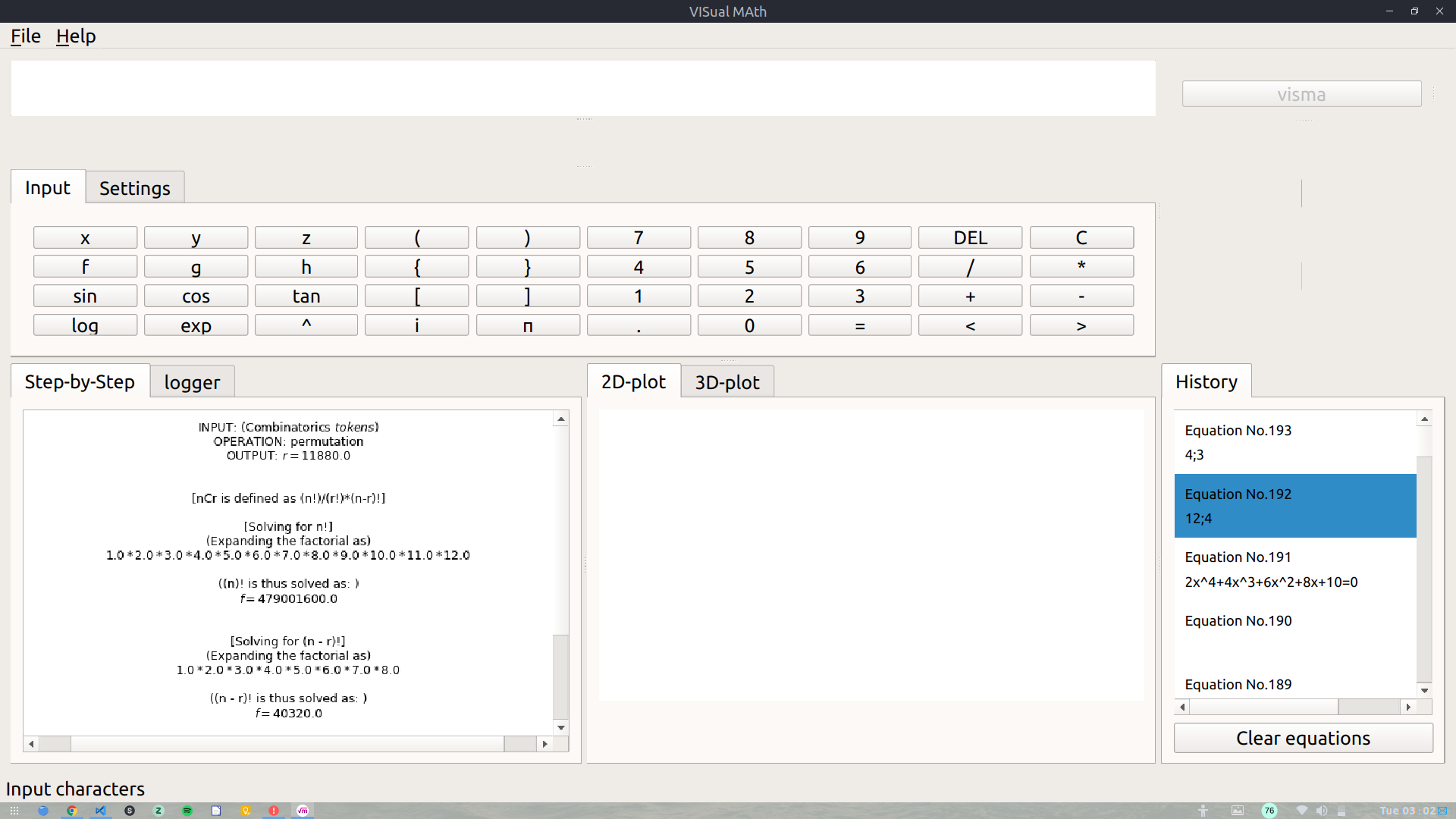
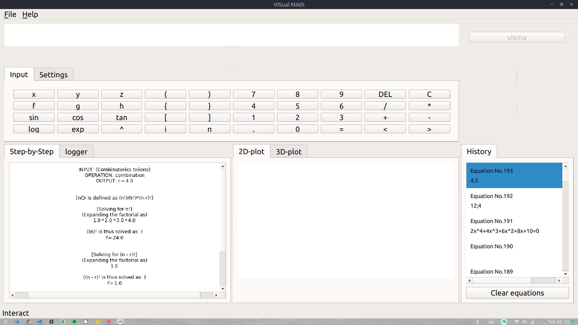
Below images illustrate the GUI/CLI representation of „factorial“, „combination“ and „permutation“ features in action.
Lastly, the project development is going at a good rate :). Some times it becomes buggy and confusing too, but lastly, it is a learning process and each bug does teach something new. I will soon be updating all the logic and working of the project in the wiki so that future developers can be helped.
We are students, taking part in Google Summer of Code 2019, and we seek your help!
We are working on an open-source project called OrbitDeterminator [w] that aims to determine the orbital parameters of satellites based on your positional data in various formats. Currently, we prepared the software so far and our next step is to test it to see how accurately it can determine satellite orbits So we would like to ask for your help in a few points to test our code under real-life conditions and your use-cases.
Our Aim, tackling StarLink and NOAAs together
We would like to tackle data of special interest for us and you, namely the StarLink satellite train and NOAA satellites. With the much talked-about StarLink observation data we can hopefully help the community to get an additional set of improved TLEs. And NOAAs are interesting for us because the TLEs are already available and we will be able to compare our results with existing TLEs.
So it would be great if you could provide us with observational positional data produced by positional observers on SatObs in IOD, UK and RDE formats. And in case there are none available yet, we would be more than happy to organize a small “global” observation campaign within the next month.
With this call-for-help, we suggest the 19th to 21st of July for us all to hunt the StarLink and NOAA satellites (more info in the information box below)
Overall Aim
With your help, we will provide you with a tool that is freely available, is easy to use and produces accurate results and benefits the satellite observing community. This information and data that you will provide will give more purpose to our code, where as we will try our best to give meaning to your data.
It would be our pleasure to end our Google Summer of Code project with this “field testing”, bringing our OrbitDeterminator package to good use within the SatObs community, and reporting our test speculations as a technical paper for the next International Aeronautical Congress 2019 call for papers in Washington DC.
Below you will find our initial line of thoughts and we are open to all discussions that will promote improvements in the same.
So who would be kind enough to answer our “call for help”? Feel free to answer on the mailing list or contact [m] us directly. We are looking forward to your positive reply!
Here are the areas where we need you and you people can help us:
Coordinating the Field Test:
Proposed Time-Span until third week of July 2019
Coordinated measurements during 48hours
We suggest to team up during 2019-07-19 18:00 UTC until 2019-07-21 18:00 UTC
Team-up together or single people. We organize via this SatObs Mailinglist!
As many single measurements as possible send via the SatObs mailing list for EVERYONE, not just us.
Deliverables by us: new code to OrbitDeterminator and also the results (under public domain licence)
Questions:
Since a lot of data that is reported in the mailing list does not contain detailed location information about the observer, we would like the location of all observers ordered by site/station number that contains: [site/station number, observer code, observer name, latitude, longitude, elevation, active/inactive, preferred reporting format].
Since all data is reported with an intrinsic measurement uncertainty, there will be some degree of error in the determined orbits as well. Can you please specify the what a typical accepted margin of error is for you?
We currently produce the 7 keplerian elements and 3D orbit plots as output, in a specified format using a command line user interface. Do you people have any other preferences regarding the user interface, input options, file extensions and the output format?
Can you provide the historical data for some satellites in all 3 (UK, IOD, RDE) formats? It will help us test our code and remove possible errors and exceptions.
We are very much interested in the Starlink satellite train. Would you please provide us with current observations for the same?
We would like to compare NOAA satellite orbits as well. But we could not find a lot of reports on the mailing list regarding the same. Could you provide some?
Lastly, can you provide some reports with the results already known? This will help us compare our results with the expected results and improve our algorithms accordingly.
PS: I am forwarding this email on behalf of the GSOC students. They subsribed a few weeks ago and just received the „Your subscription request has been forwarded to the list administrator at seesat-l-owner@satobs.org for review.“ notice and no further confirmation. Would you please be so kind and subscribe them to the list? It will make conversion much easier for them.
With these series of blogs posts I will be documenting the progress of my project and my experience working with aerospaceresearch.net for Google Summer of Code 2019.
First, a few words about my mentors from aerospaceresearch.net and the communication between us. The main mentor of my project is Manfred Ehresmann, with whom we discuss almost daily for everything regarding my project. Since there is also a lot of development going on from Manfred’s side, effective communication for defining my project’s requirements, coming to common ground regarding technical matters that affect the work of both and solving any issues that arise has been key to the progress of my project and I am very happy that we have effortlessly achieved this. My second mentor is Andreas Hornig and since he is the main mentor of other projects, we communicate on a less regular basis for everything regarding my work with aerospaceresearch.net and my participation in GSoC. Andreas has also been incredibly helpful throughout this time, from guiding us through the application process to taking care of our onboarding in the organization and making sure that we have everything set up to be able to work undistracted on our projects. The platform that we use for our communications is Zulip.
Now it’s time for an introduction to the GSoC project and my contribution. Manfred is developing a software for designing space craft systems, currently limited to electric propulsion units for satellites. Since in the engineering world, the word “design” is most of the times synonyms to the word “optimize”, the later is actually the goal of the software. That is, to use data from existing systems and additional resources along with system modelling and scaling rules, in order to apply a genetic algorithm that can design an optimized space craft subsystem, which is an electric propulsion system currently, for different mission scenarios. This optimization is not straight forward, especially when there are a lot of sub-systems with non-linear interactions between them to be included in future development. Additionally, the algorithm itself has a lot of hyperparameters, whose tuning is a non-trivial task. For this reason, it is useful to have a way to evaluate the progress of the optimization process, in order to gain insights that can either lead in improvements of the algorithm or be directly utilized my human designers as well as aid in debugging of newly added features. This is where my contribution to the code comes. I am developing a visualization system which can be used to automatically generate useful visualizations from the evolution data of the genetic algorithm according to user defined parameters.
Let’s say a few words about the work that has been completed during the 1st coding period. During the previous weeks I have been laying out the architecture of the visualization system, defining the structure of the xml file that is used by the user to communicate with the system and implementing the first type of plot, the 3d plot. By this time, you may wonder what this plot is, in which way it is using the evolution data and how is it even useful in the first place! To get a better understanding, let’s talk about optimization for a second.
What does it mean to optimize an electric propulsion system? Well, first let’s define what it means to design a system. To design a system means to select the appropriate values for some variables of the system. These are here the effective exhaust velocity, thrust, propulsion type, propellant and more. For initial system design these are enough to fully define the rest of the systems parameters by using known system modelling equations and scaling laws equations as well as any system or mission requirements, for example total impulse, velocity increment, propulsion power. We can name the first set of variables, independent degrees-of-freedom (dofs) of the system, and the second set of variables that are calculated from the first, dependent dofs. The goal of the design process is to come up with a system that achieves a certain performance. If we define a specific performance criterion (ex. mass fraction of the electric propulsion unit), then by systematically searching for the best (optimal) values of the independent dofs we can come up with a system that best meets this performance criterion (ex. has the lowest mass fraction). This process is called optimization. In our case, a genetic algorithm is used for searching the optimal values of the independent dofs, which can be either continuous variables (ex. effective exhaust velocity, thrust) or discrete variables (ex. propulsion type, propellant). The electric propulsion system has also additional dependent variables/parameters (ex. mass fractions and efficiencies of sub-systems) which are calculated from the independent variables.
By visualizing the evolution data, we want to observe how the system moves along the design space during the optimization process. We want to see whether the mutations of the system are successful or not and we want to identify the design points where the system converges and possibly observe any other piece of information or pattern that can help improve the optimization and better understand the optimal designs. For this purpose, we want to plot different system variables (ex. effective exhaust velocity, thrust, propulsion type, propellant etc.) against the objective criterion (ex. system mass fraction). Using a 3d plot we can assign the objective criterion to the z-axis, the effective exhaust velocity to the x-axis and the thrust to the y-axis. In order to include additional dofs into the visualization, we can encode them into other aspects of the visualization, specifically line style, line color, marker and marker color. Continuous or discrete dofs can be assigned to line color and marker color by mapping the values of the dofs to the colors of a corresponding color map. Additionally, discrete dofs can be assigned to line style and marker by mapping the values of the dofs to a corresponding set of line styles and markers.
Using the xml file, we can define which system dofs (ex. system mass fraction, effective exhaust velocity etc.) are assigned to each plot dof (x-axis, y-axis, line style, line color etc.). The key capabilities of the visualization system can be summed up in the following points:
-) Flexible
assignment of system dofs to plot dofs.
-) Selection of color maps, line styles, markers etc. to be used in the visualization.
-)
Definition of default visualization style.
-)
Activating or deactivating the visualization of failed mutations.
-) Defining
custom visualization style for failed mutations.
-) Defining
custom visualization size for seed points.
-) Defining
multiple plot cases.
-)
Specifying active input cases.
-) Sorting lineages by a specified dof.
-) Selective plotting of lineages.
In order to get a better understanding of the capabilities of the visualization system, let’s go over a few potential use cases. Let’s say that an optimization campaign has been completed and we would like to start exploring the evolution data that has been created by the genetic algorithm.
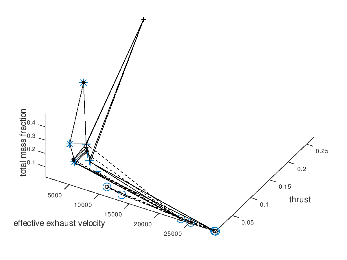
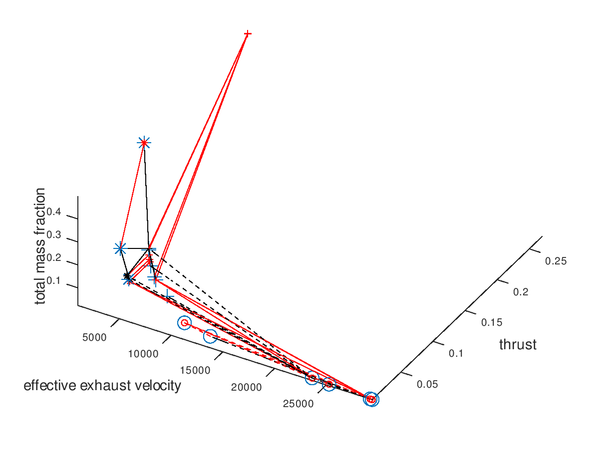
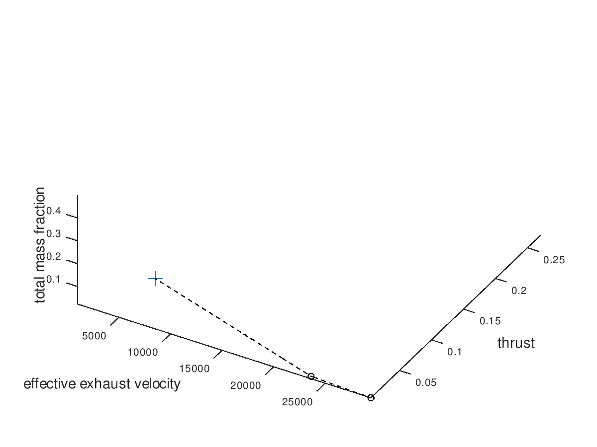
First, I assign the system dofs, for which I am interested, to corresponding plot dofs. In these examples I am going to assign effective exhaust velocity to x-axis, thrust to y-axis, total mass fraction to z-axis, propulsion type to line style and propellant to marker. I will also define that the possible propulsion systems (arcjet, grid ion thruster) are going to map to line styles (solid, dashed) and the possible propellants (He, Xe, NH3) are going to map to markers (crosshair, circle, star). I am also going to activate the visualization of failed mutations, but I am going to leave deactivated the custom visualization style for failed mutations, since with this first visualization I just want to observe how the design space has been explored by the algorithm. The visualization system returns the following figure:
In the figure above, we can see that only a certain portion of the design space has been explored. The seed points are represented by the large blue markers. Since line color and marker color has not been assigned to a system dof, they are black, which is the default visualization style that I have specified.
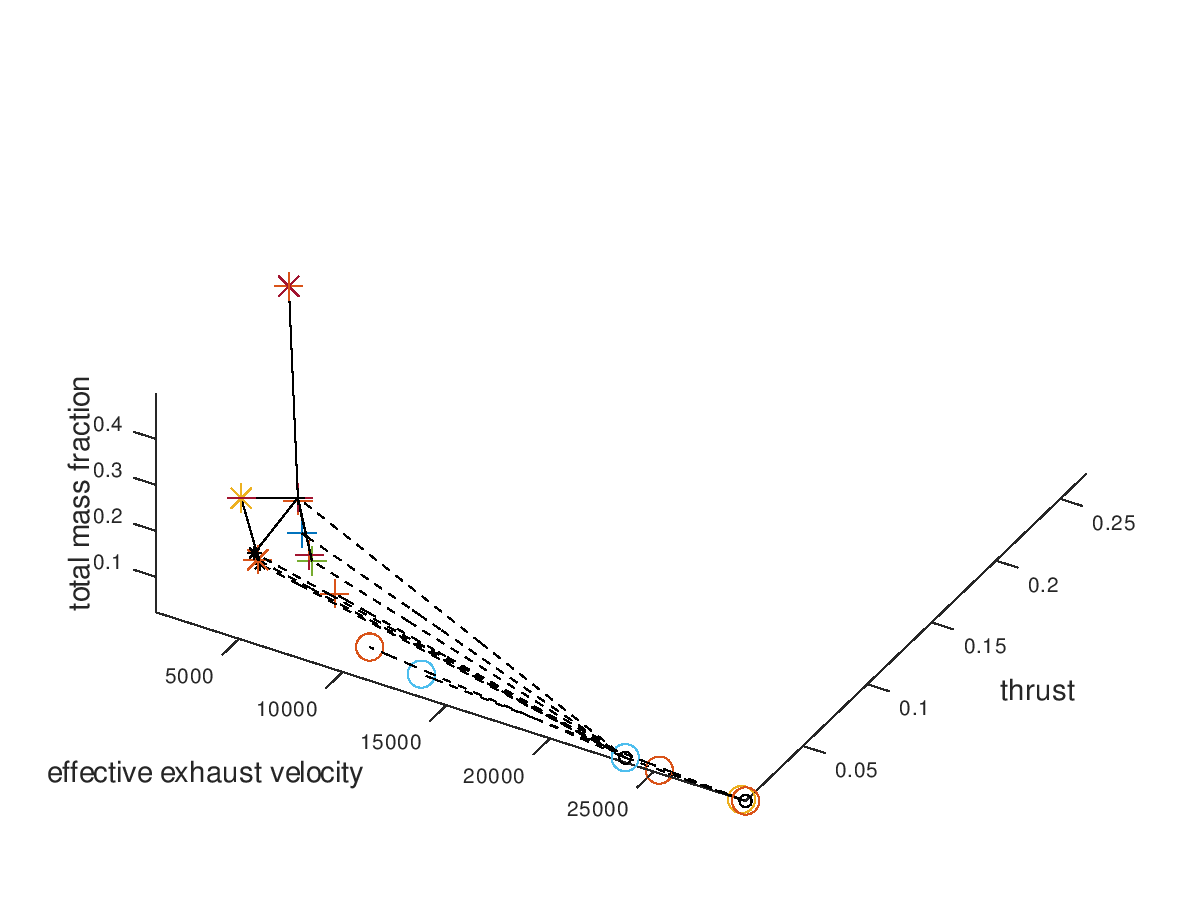
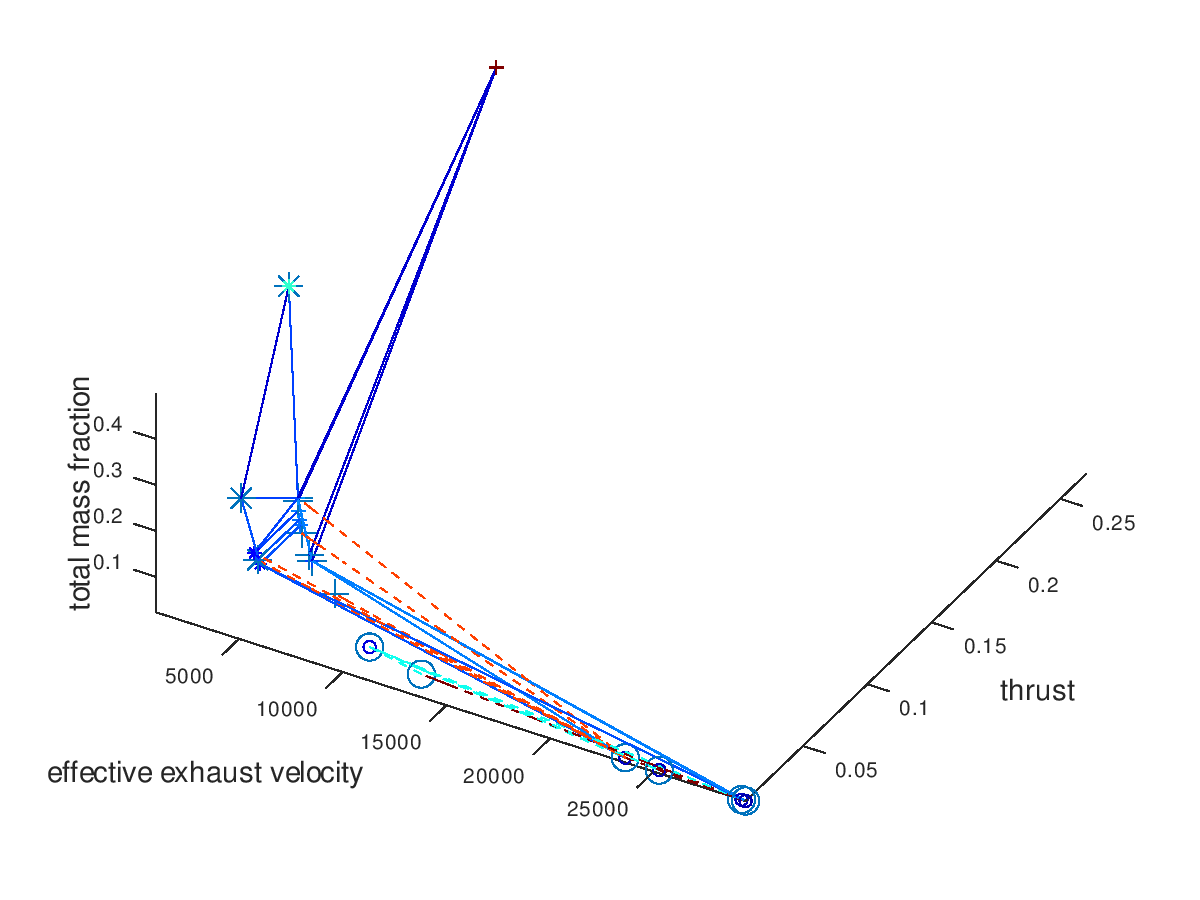
Now we are going to use the capabilities of the visualization system to gradually get a deeper understanding of our data. It would be interesting to see which portion of the mutations are successful. For this purpose, I am going to activate custom visualization style for the failed mutations, and I will specify red color for line color and marker color. The visualization system returns the following figure:
From the figure above it is clear that the majority of the mutation are failed mutation. For this reason, I would like to visualize only the successful mutation. To do this, I deactivate the visualization of failed mutations. The visualization system returns the following figure:
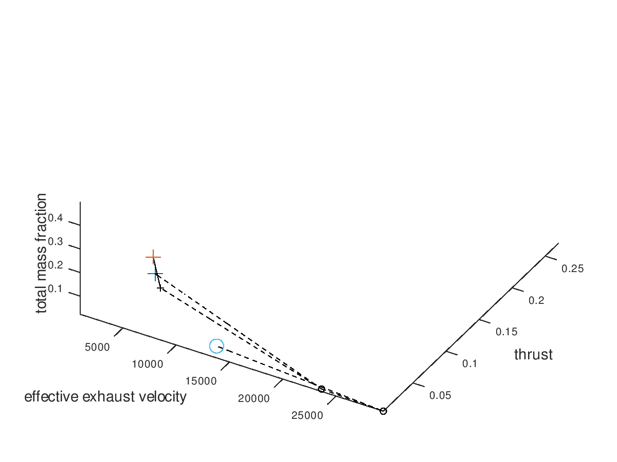
The trend of the optimal design points to converge to high effective exhaust velocity, low thrust, grid ion thruster propulsion (dashed line) and Xe propellant (circle marker) is easily recognizable. Note that the seeds points have now different colors, which is currently a bug rather than an implemented feature. Next, I want to visualize only the three best designs. For this purpose, I am going to define the total mass fraction as the sorting criterion of lineages and select “increasing” as the sorting direction, since the best designs are the ones with the lowest total mass fractions. The visualization system returns the following figure:
We can see that all 3 lineages converge to the same design point. It would be interesting to also explore the behavior of the 3 worst lineages. The visualization system returns the following figure:
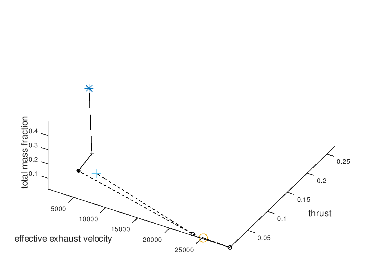
By surprise, the three worst lineages also converge to the same optimal design point. This means that our algorithm is very robust to the selection of initial seed points, at least for this simpler example. To confirm that all lineages converge to the same design point, I am also going to visualize only the worst lineage. The visualization system returns the following figure:
Indeed, all lineages converge to the same design point because the worst one does so. At this point we could come up with more visualizations to explore, but for the purpose of briefly demonstrating the flexibility of the visualization system these examples are considered enough.
One last thing to demonstrate is what the visualization would look like when line color and marker color are also assigned to a system dof. That would be the case if the model of the electric propulsion system had additional independent dofs. For this example, we are going to assume that two hypothetical continuous dofs are assigned to line color and marker color respectively. I am going to define “jet” as the color map for both line color and marker color. I am also going to activate the visualization of failed mutations and include all lineages in the visualization. The visualization system returns the following figure:
As we can see from the figure above, the two additional dofs have been encoded in the visualization.
Summing up
this first blog post, there are still a few things that need to be implemented
in the visualization system regarding the presentation of the 3d plot (labels,
legends, viewing angle, limits etc.) which will be added soon. An additional
type of plot as well as animation capabilities are going to be added during the
following coding periods. But for now, …
Many thanks
for reading and cheers to the space and GSoC community!
This blog post is intended to pen down my experience of working with aerospaceresearch.net and on VisMa – Visual Math as a part of Google Summer of Code 2019. A part of this blog post will be about how it feels to be working here & other parts will focus on technicalities of the project (about how VisMa has been improved over the past three weeks).
Firstly, working with aerospaceresearch.net has been a great experience. The mentors of the project Shantanu, Manfred & Siddharth are very helpful. We almost regularly have chat on Zulip (& sometimes on WhatsApp) wherein we discuss the plans for the project and about implementation. Owing to these healthy discussions the project development is going at a fast rate (which is indeed a good thing!). The code base of VisMa is very well written and the complex task of simplifying mathematical equations has been beautifully coded. About the workload, I work regularly for 5 – 6 hours, but sometimes when a crucial bug finds its way in, the work time has to be increased. Overall it’s a Fun & Learn experience.
Now let’s talk about what we (the VisMa Team) have achieved so far. During the community bonding period, I spend my time to get equipped with basics of PyQt (on which the GUI of VisMa is based) and spend the remaining time studying the tokenizing and simplify modules. Honestly, these modules were hard to understand. But the effort turned fruitful during the coding period. Also, I completed the task of simultaneous equation solver during this time. The logic was easy to frame, but the inclusion of comments and animations was tricky and involved the entire redesigning of the LaTex generator module (the part which created the final latex to be displayed in GUI).
Over to the first week of the coding period, the task which was decided was to re-design all the simplify module in an object-oriented fashion, which before coding period I believed would be most difficult to write (after all more than 2000 lines of complex Pythonic logic, to be honest, was scary). But, efforts to understand module during the Community Bonding Period turned out to be fruitful, and I was happy to achieve this task in the desired time. Like any other programming project, there are some minor bugs out there, which will be fixed in the upcoming time!
Coming to week second, we decided to work on Expression Simplification. Now, what expression is, briefly (& vaguely) any part of inputted equation enclosed in brackets can be termed as an Expression. So like when we solve an equation by hand, we solve the bracket part first, our task was to make visma do same! Earlier it didn’t support Expression simplification. For that, we decided to go for a complex recursive logic (solving the inner expression first then the outer expressions & so on). Recursive logic was complex & time consuming to implement, taking care of all comments & animations during recursion was a challenge. It took somewhat 9 days to come up with something fruitful. But yes it was worth it, VisMa could easily solve Expressions now. A happy moment indeed! 🙂
Next phase was to include a new module to VisMa. It was decided it has to be a Discrete Math module (‚cause why the heck not!). We decided to go for Combinatorics stuff first, thus implementing Combinations & Permutation stuff. These modules require factorial of a number, I got this idea why not to implement factorial as a separate module and then use in Permutations & Combinations stuff. This added another factorial feature to VisMa.
For now, I am working of adding triple degree equation solvers to project. We as of now have decided to do so using Cardano Algorithm. If this turns out well it will also be done for four-degree equations. After this will be done, VisMa will be capable of solving & showing detailed steps for up to 4-degree equations.
Below is a short GIF showing some of new features in action:
Hope you enjoyed reading Chapter One of my Developer Diary. From now on, I will write these blogs bi-weekly.
My name is Shoumik Dey. I am currently a second year student at Manipal Institute of Technology, India. I preserve strong interest in aviation, aeromodelling and maybe this is the reason that I have chosen to work on this project, this summer, for Google Summer of Code 2019.
This is the first blog post for this project. This post will describe the work done so far, the current outcomes, hurdles faced and also they were/can be be solved.
Introduction
‚ADS-B‘ stands for Automatic Dependent Surveillance–Broadcast. The aircraft automatically brodcasts each frame on the 1090MHz frequency periodically which contains navigational data, such as, location, altitude, airspeed etc.
All ADS-B frames do not contain location information in them, therefore the ultimate goal of this project can be described in two parts:
Self-syncronisation of the ground stations in focus without an external agent.
Determining the location of the aircraft when location data is not received using multi-lateral positioning
Self-synchronisation
The current and widely used method of synchronising the clock of any ground based station is by using GNSS(Global Navigation Satellite System)-receiver interrogation. The local clocks gets aligned with the atomic clocks in the satellite.
But in this case, the synchronisation takes place by calculating the actual point of time when an aircraft broadcasts a message. This serves as the reference time at all ground stations, and since this time value is same all over, hence all the stations become self-synchronised.
Data required for self synchronisation:
Time of arrival of the message at the ground station
Time difference of arrival at that station.
Calculating the time difference of arrival(TDOA):
The receiver provides the time at which the frame(with location) is received.
The time of travel of the frame is calculated by using simple math and that is subtracted from the time of arrival.
sqrt((x2-x1)^2 + (y2 - y1)^2 + (z2 - z1)^2)
where x1, y1, z1: Latitude, longitude and altitude of ground station; x2, y2, z2: Latitude, longitude and altitude reported by aircraft.
Data that we have for self-synchronisation:
We have decided on using dump1090 for generating the ADS-B messages from the IQ stream as recorded by the SDR radio. Dump1090 provides the mlat(multilateration) data in avr format. The first 6 bytes of the message provides the sample position of the last bit of that message.
Next, we shift the sample position record from the last bit of the message to the first bit.
Typical recording of a 112 bit ADS-B messageTypical recording of a 56 bit ADS-B message
As we can see, the length of the messages is exactly half of each other.
The sample position reported by dump1090 is exactly 240 samples ahead of the preamble (You can see the preamble at the beginning, by 4 spikes in the signal).
So, the sample position is taken back by 240 samples for both the cases to reach the beginning of the preamble.
Now, data in hand:
Start time of the stream
Sample position of the beginning of the message in the stream.
Therefore the time of arrival(TOA) can thus be calcualted.
Work done so far
A plugin to import the mlat output of dump1090 (ADS-B raw) has been created, which imports the message and the sample position into the main program
The raw data is reorganised in our suitable format and terms.
With each frame present;( for 112 bit frames as of now)
Determination of the type of frame and it’s content
Decoding those data present in that frame
Output dump file which contains the frame and the data contained in it. (Only extraction, no calcualation)
Next up….
The next blog post will contain the implementation of the calculation layer of the project. In this layer, the data in the frames will be processed and information such as position, velocity, altitude will be covered.
The post will also contain the unusual findings and irregularities that were found in the stream and how we have decided to deal with it.
This blog post will cover the process of visualization of NOAA images, specifically we will talk about general visualization pipeline and different ways to visualize satellite imagery, including creating interactive web maps and virtual globes.
Visualization pipeline
We shall start from the very beginning. NOAA satellites constantly scan the Earth’s surface and then transmit it as a radio wave signal. This signal is captured by SDR (Software-defined radio system) and saved in wav format. Next step is dedicated to decoding this signal, i. e. finding sync signals, extracting and decoding an image line-by-line.
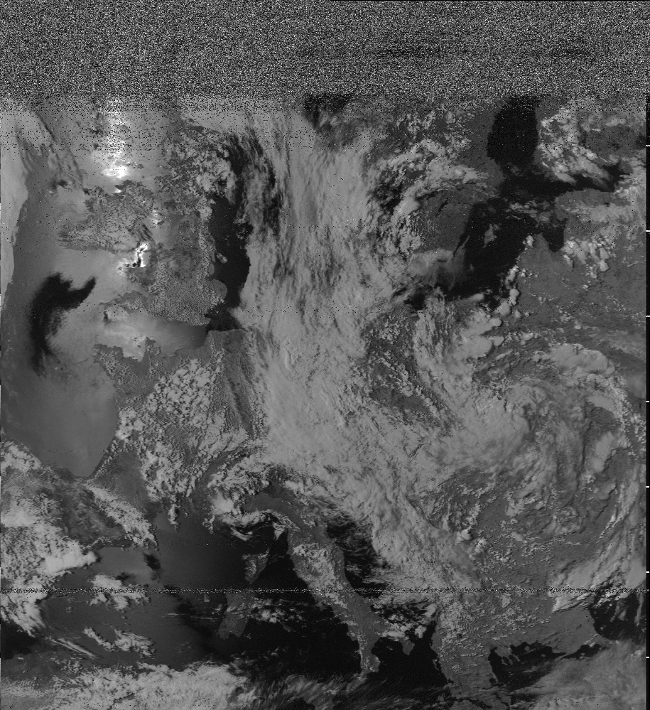
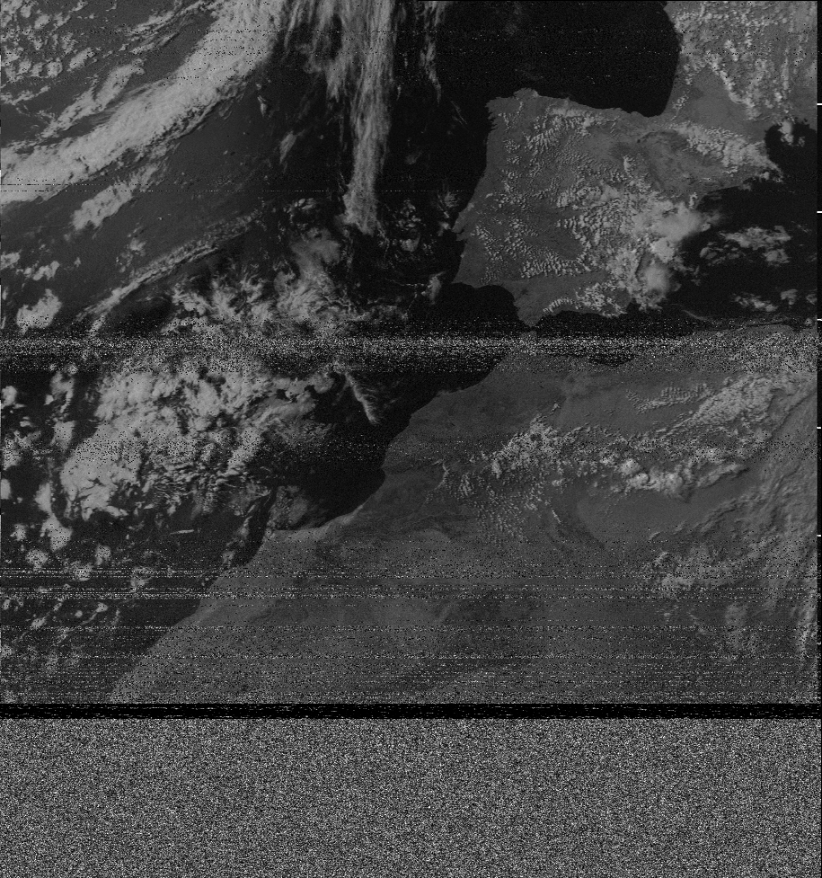
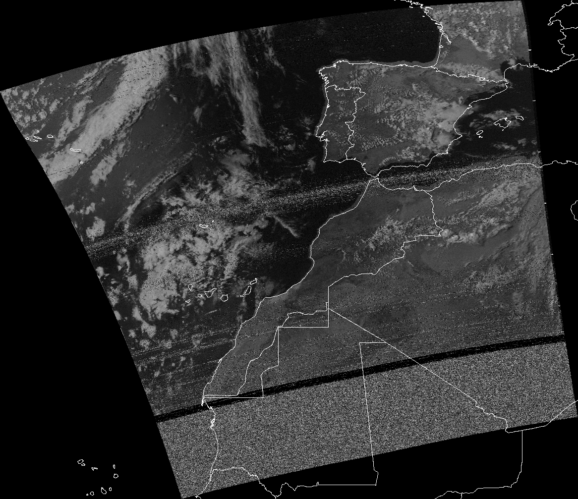
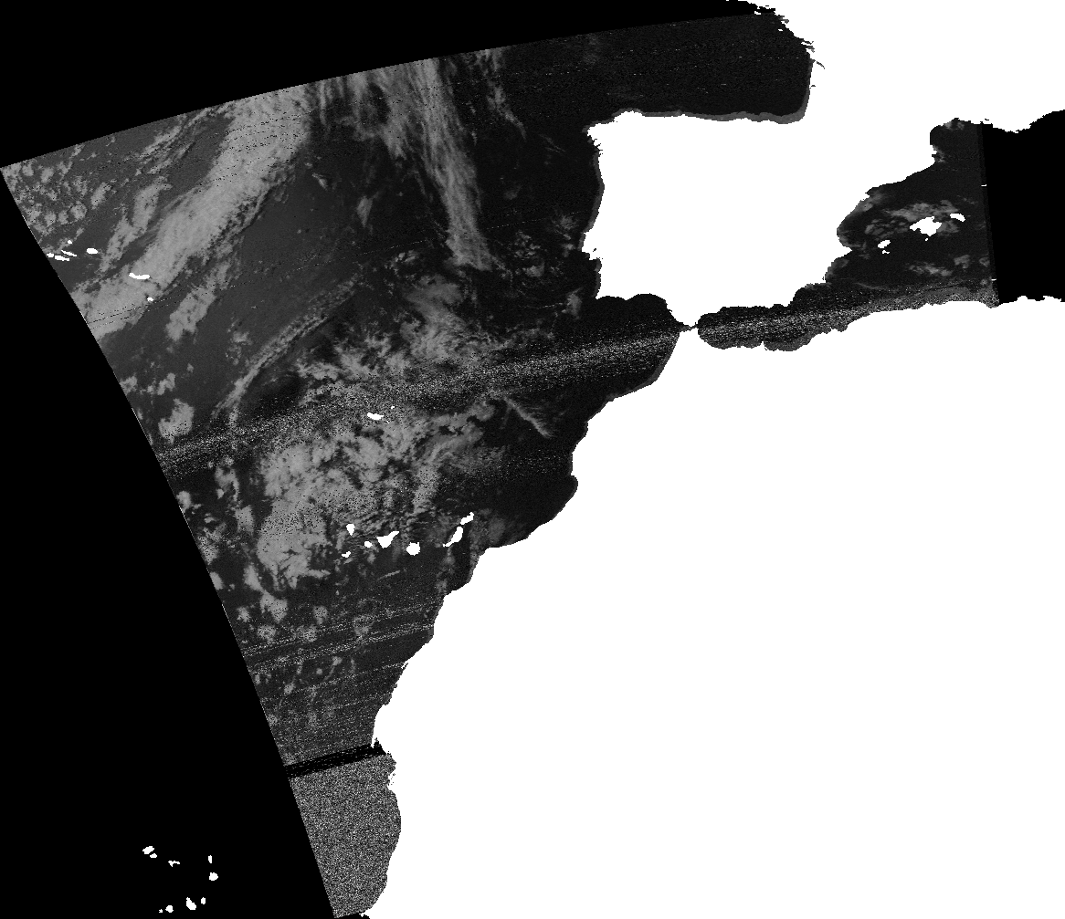
The decoded image includes both sync signals and 2 variants of the scanned image (in different color schemes), therefore it requires one more preprocessing step, where it is being cropped and rotated. Next two images are the results of this step, they will be used as an example for visualization.
Figure 1. Example of decoded image.
Figure 2. Example of decoded image.
Next step is georeferencing, which has already been described in previous post [1]. On this step, the coordinate system will be assigned to the image, every pixel will have a corresponding geographic coordinates. Main computation is done with gdal library.
Merging images
The goal of the project is to primarily create tools, that could visualize a set of satellite images. It means that we must find a way to combine several images into one standalone raster, which we could then display as a web map or as a virtual globe.
Using tools from image analysis (image stitching) would be a bad approach, because of two reasons:
these methods are approximate in their’s nature
do not take in account image distortions
A better approach would be to use pixel’s coordinates. We know the coordinates of each pixel, thus we could tell exactly where it will be located on the new image. For overlapping areas, for each pixel we will have one of 3 cases:
no pixels mapped to this pixel
1 pixel is mapped is mapped to this pixel
several pixels mapped to this pixel
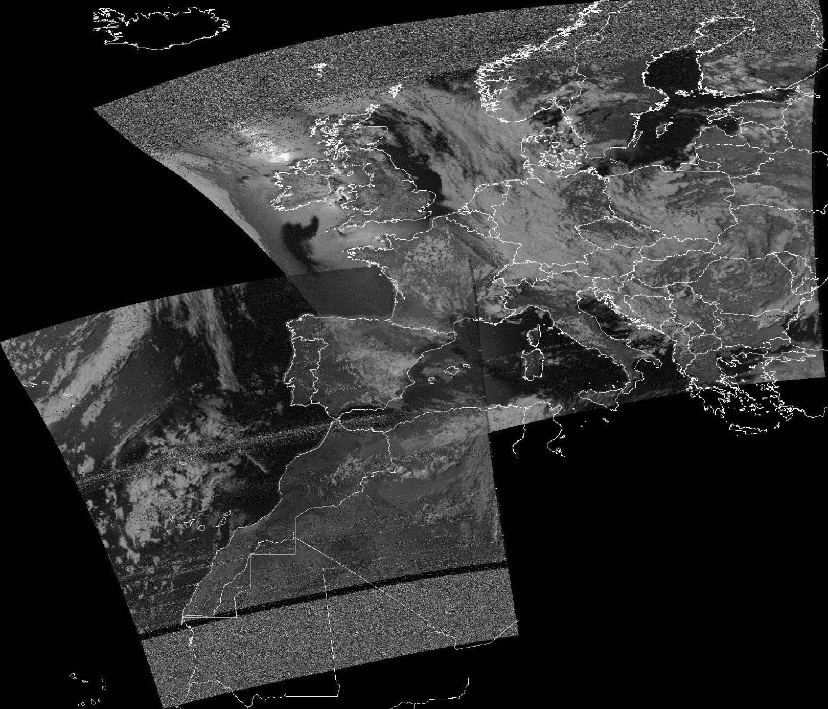
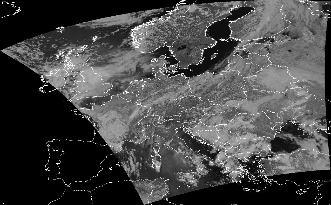
If no pixels have been map to the position, then it will be filled with special no-data value. If there is one pixel, then it’s value will be assigned to the corresponding pixel on new image. If there are several candidates for certain pixel, we will compute new pixel value from them based on some strategy, for example taking max or average. In this example we’ll use averaging for overlapping regions. Below is an example of merging 2 images above, country boundaries added for clarity.
Figure 3. Example of merged satellite images.
As you may see, there is still a contrast present between the images and the overlapping part, the reason for this are different lightning conditions for images. Nevertheless, image quality with this method outperforms other methods, like taking maximum for example.
Creating TMS
On this step our raster will be transformed to yet another representation, which will be used for further visualization.
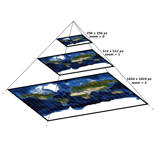
TMS (Tile Map Service) – is a protocol for serving maps as tiles i. e. splitting the map up into a pyramid of images at multiple zoom levels [2]. See the image to better understand the concept.
Figure 4. Tiles pyramid.
So for each level zoom level a set of tiles is generated, each tile has it’s own resolution and will be displayed at specific position at specific zoom. To generate this set of tiles gdal2tiles.py program is used, it transforms an input raster into a directory tree with tiles [3].
It should be noted that TMS is not the only choice here, another alternative is WMS (Web Map Service) [4].
Interactive web-maps
Finally, having TMS tiles computed we could create a web map. To do this we will use leaflet.js, which is a library for web-mapping applications. [5] We will combine two layers, the first one is our tiled raster, which will be loaded from local directories and the second one is Open Street Map layer which will be loaded from OSM site. The code for map is contained in the map.html file and could be opened directly in browser. You can see a live example here https://caballeto.github.io/map.html, or in the iframe below.
Virtual globe
Another way to visualize satellite images is of course to plot them on virtual globe. Once again we could use already computed TMS tiles here. To render the globe we will use webglearth2 library, which is created exactly for this purpose. Similarly to a web map, we will add an OSM layer as a background layer. To open it locally you will have to start an http server, and then open the globe.html via http. Running commands (run from directory where globe.html is stored):
python -m http.server 8000
go to browser and connect to localhost:8000/globe.html.
To create presented visualizations for a raster, you can use generate_map.py tool from directdemod package. It will automatically create tiles from your raster and then will generate corresponding map.html and globe.html files.
Conclusion
In this post we’ve looked at different ways and tools for raster visualization, specifically we’ve analysed the visualization pipeline for satellite imagery. Presented types of visualizations are compatible with many different mapping applications (leaflet, openlayers etc.) and could be easily published and used on the Internet.
This post will cover the installation process of DirectDemod package, we’ll also talk on how to create pretty map overlays using the directdemod.georeferencer module.
Installing DirectDemod
Recently, the installation process for DirectDemod has been updated (currently on Vinay_dev and Vladyslav_dev dev branches only). You must have anaconda or miniconda distribution installed. From here do the following:
Before creating map overlays we need to have a georeferenced image, let’s make one. samples/decoded directory contains 2 already decoded and preprocessed NOAA images ready for georeferencing. Create an empty file – SDRSharp_20190521_170204Z_137500000Hz_IQ.wav in samples directory, it will serve as a placeholder; the image was already extracted but the name of SDR file contains valuable information needed for georeferencing.
To georeference the image, we will first extract information from the name of SDR file. Go to directdemod directory and type the following command.
misc.py extracts data about satellite’s orbit and position, and then embeds it in json format into created tif file.
Now we will use georefencer.py CLI interface to georeference the image and create a map overlay. -m or –map option tells the georeferencer to overlay the image with map boundaries after georeferencing.
Figure 1. Georeferenced image combined with country boundaries.
Note on shapefiles
A shapefile is a vector data storage format for storing geographical features [1]. In the context of this application, country boundaries are being represented as a shapefile. Inside the shapefile points may be stored as polygons or as polylines, overlaying an image with polylines will have an effect of overlaying country frontiers, while overlaying an image with polygons will have an effect of overlaying country areas.
Figure 2. Georeferenced image combined with polygons shapefile.
Further work
The next blog post will discuss merging NOAA satellite images, including different techniques for handling overlapping areas cases.
Let me introduce myself, my name is Vladyslav Mokrousov, I am a second year student at software engineering department of Kyiv Polytechnical Institute, Ukraine. This summer I will be working on Google Summer of Code (GSoC) project for AerospaceResearch.net.
This blog will briefly describe the goal of the project, and then will proceed to describe what has been done so far.
BigImage and BigGlobe Projection
During this summer I will work on creating software for visualization of satellite imagery, mainly images from NOAA satellites. The goal of the project, as my proposal states:
Current software provides possibility for decoding APT signals received by RTL-SDR receivers, but the task of understanding the extracted data is hard, because an open-source programs for proper visualization of these images do not yet exist. This project aims to create an open-source software to target that issue, so more developers and enthusiasts will receive an efficient tool to help them in their research. The software would provide functionality for creating different types of interactive visualizations of satellite weather images, along with their georeferencing.
Particularly, I am working on software, which will combine many satellite images into one big picture (BigImage). The software will handle cases of overlapping images using different merging strategies. Another main task of the software will be to provide accurate image georeferencing [1].
Image georeferencing
Image georeferencing refers to the process of associating image coordinate system with geographical coordinate system, i. e. each pixel of the image will be paired with certain geocoordinates. This will allow combining these images with maps or with each other.
Figure 1. Georeferenced image combined with map.
An example above shows how the georeferenced image can be used for visualization. The process of georeferencing is divided in two parts:
Computing set of Ground Control Points (GCPs).
Fitting the image to match these GCPs.
To compute GCPs we will use the TLE file, which describes the orbit parameters of the satellite. Using pyorbital module we consistently calculate the position coordinates of satellite and match them with relative position of pixels on the image. The 2 part is carried out by gdal [2] library, which is called via it’s Python API.
Performance
The aim for created software is to produce visualizations of big amount of image data, therefore the implementation should be fast and should handle memory expensive cases. To satisfy this requirement gdal library is used. It is an open source software designed for raster and vector data manipulations. gdal is written in C++, that’s why it is extremely fast. Manual memory management ensures the efficiency of memory use. The implementation makes use of gdal Python bindings, which provide interface for using gdal functionality in Python.
Further work
Image georeferencing is the first step required to produce good looking projections of satellite images, especially for creating image overlays. In the next blog we will talk about map overlays and techniques for merging overlapping parts of NOAA images.
Now it is up to you to decide if you want to code open-source space with us during ESA Summer of Code in space 2019? You should!
Be our Summer Student and code your open-source space projects. You get stipends of up to 4000€. The Call for ESA SOCIS 2019 is now open!
Together, we as AerospaceResearch.net, Ksat-Stuttgart (University of Stuttgart) and EP2Lab (Carlos III University of Madrid) are proud to be selected as official mentoring organizations for the ESA Summer of Code in Space 2019.
And we are now looking for students to spend their summers coding on great open-source space software, getting paid by ESA, releasing scientific papers about their projects and supporting the open-source space community by useful programmes.
Are you a student? You have time until May 4, 2019, to apply for various coding ideas to work on, and be part of out team!
ESA Summer of Code in Space (SOCIS) is a program run by the European Space Agency that focuses on bringing student developers into open source software development for space applications. Students work with a mentoring organization on a 3 month programming project during their summer break.
Through SOCIS, accepted student applicants are paired with a mentor or mentors from the participating organizations and with experts from ESA (where available), thus gaining exposure to open source software development and insights from ESA. In turn, the participating organizations are able to prototype new open source projects and possibly bring in new developers to work on relevant topics for space.
SOCIS is inspired by (but not affiliated or related in any way to) Google’s Summer of Code initiative, and is designed with the following objectives in mind:
raise the awareness of open source projects related to space, especially among students;
raise awareness of ESA within the open source community;
improve existing space-related open source software.
Again for the 5th time, AerospaceResearch.net[0] is proud to be selected as an official mentoring organization for the Summer of Code 2019 (GSOC) program run by Google[1]. And we are now looking for students to spend their summers coding on great open-source space software, getting paid up to 6600 USD by Google, releasing scientific papers about their projects and supporting the open-source space community.
Until 9. April 2019, students can apply for an hands on experience with applied space programs. As an umbrella organisation, AerospaceResearch.net, KSat-Stuttgart e.V. and ep2lab of Carlos III University of Madrid are offering you various coding ideas[2] to work on:
The Distributed Ground Station Network – global tracking and communication with small-satellites[2][4]
KSat-Stuttgart – the small satellite society at the Institute of Space Systems / University of Stuttgart[2]